Showing posts with label Aspects of Design. Show all posts

Saturday, 16 March 2013

Unrepeatable!

One of the characteristics of the Gelli Plate is that it is highly unlikely you will ever get identical prints. This can be a good thing, because half the fun is not knowing what the print will come out like until you see it. However, it can be annoying when you get a really good print and know you'll never be able to repeat it!

I was playing with some Crafter's Workshop masks, one of which was the Mini Roman Letters (by Dina Wakley). This is the first print I made with it. Possibly my best Gelli print yet!


I didn't want to cover up too much of it, so all I added was some stamped clocks (Crafty Individuals), a column top (Non Sequitur) (I think it's actually Greek but I'm pretending it's Roman) a couple of gods (part of an Aspects Of Design stamp) and a printed picture (Crafty Individuals).


Think I might have to keep this card. I'll never be able to make another like it!

Sunday, 5 August 2012

Things with wings

The theme for August's Stampalot Challenge is right up my street! It's

TAKE FLIGHT

Now that should give plenty of scope - birds, insects, fairies, angels, or even aeroplanes spring to mind -  but for me it just has to be my favourite subject, butterflies!

I've been a bit awol over the past few weeks, busy with various things which have kept me away from blogging (some of which were crafty stuff, but more about that another time!) but I did manage to make my butterfly cards.


For the first one the butterflies are from a Hero Arts Framelits set. I've stamped them on to printed papers from Crafty Individuals (Book 3 Springtime) and then cut them out with the Framelits die included in the set. I've used the same papers for the centre circle, and for the banner (banner stamp by Waltzing Mouse and butterfly word by Crafty Individuals). The doily is by Cheery Lynn.


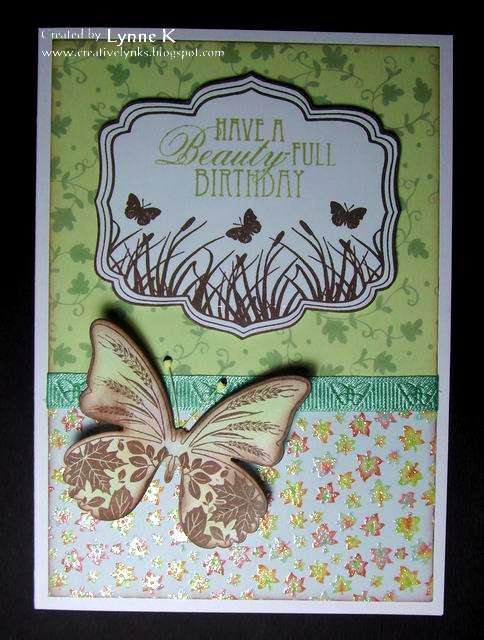
My second card showcases one of my latest acquisitions, by Prickley Pear, which is fast becoming one of my all-time favourite butterfly stamps, along with the others in the set!


Here the butterfly has alighted on a background of Trimcraft papers ("Neighbourwood" by Helz Cuppleditch) with an Aspects of Design (by The Stampman) Nestie frame stamp, sentiment by The Craft's Meow, and ribbon from my stash. The butterfly has a matching die (available separately) which makes cutting it out so easy.


There are two different sets of the Prickley Pear butterflies, and I have to confess I bought them both! How could I have resisted when they are all so beautiful? You'll be seeing plenty more of them in the not too distant future!

But back to August at Stampalot Challenge. The prize is fabulous, as usual.


My lovely teamies have come up with some absolutely gorgeous designs, so do pop over to the Challenge Blog for plenty of inspiration. I have a feeling that this month's theme is going to be very popular, and I'm looking forward to seeing lots of winged things, butterflies or not!

Sunday, 22 May 2011

Butterflies!

Less is More has my favourite subject for Week 16's challenge - Butterflies! Great, I thought! But since butterflies tend to make an appearance on many of my cards, even if only tiny, coming up with something I haven't already done before wasn't so easy! Fortunately I hadn't yet got round to using my new Aspects of Design Framie 5 stamps bought a while ago from The Stamp Man, so this was the ideal opportunity.

Very simple, just cut out the stamped image with the matching Nestie (Labels 5) and coloured it with Cosmic Shimmer paints. Added the sentiment (Inkylicious).  Then stamped a flight of Crafty Individuals butterflies across the bottom.

Card number 2 is already in the making!

Sunday, 13 March 2011

Footprints

I'd like to begin this post with a big thankyou to everyone who has commented on my blog.  I was thrilled to get 48 comments on my entry to Week 5 of the Less is More challenge, a record for one post for me, and I can assure you that every single one is much appreciated and makes it all worthwhile.

It's now Week 6 of Less is More, and they want to see a one layer card with the intriguing theme of "Off the Edge". My first thought was of footprints marching on to and off the page. Trouble was, I didn't have a footprints stamps, but I figured it would be a fairly easy shape to carve by hand, so I made one from an eraser. I did, however, have the perfect sentiment to go with it, from an Aspects of Design set by The Stampman. I've had the set for a while, but haven't had occasion to use the sentiment before, and it's one I really like. I stamped that first, then made the footprints walk across the page in different colours of Versamagic inks.


I think this is a great theme, and some of the examples already posted at LIM are fantastic. I feel a second entry coming on, if I get time this week!

Wednesday, 1 September 2010

Parks and Gardens

This week's challenge at Allsorts is called "Park Inspiration", and they want our entries to be inspired by gardens or parks. There's a £10 voucher to be won to spend at One Stop Card Crafts! Well, of course, parks and gardens say "nature" to me, and since that's my favourite theme it was no hardship to come up with a card to fit.


Having recently treated myself to the Katzelcraft "Nature & Travel Quotes" set by Isabelle Norris, this was the perfect opportunity to use some of them. The background was stamped with Versamark and clear embossed, to act as a resist, and I coloured over the stamping with various pigment inks. Then the embossing was removed by covering it with kitchen paper and ironing over it with a hot iron.


The sentiment is an Aspects of Design stamp from The Stampman. (Such a pity they had to spell "marvellous" the American way.) It's from a sheet called (IIRC) "Rambling", but I can't find it on their website now. I bought it at a low sale price some time ago, so I'm wondering whether it's now no longer available.

The butterfly, from the gorgeous "Patchwork Butterfly" sheet by Elusive Images, is coloured with Promarkers and has a touch of Diamond Glaze on the flowers and body, although it's hard to see that in the photo.

Thursday, 26 November 2009

Fab Stamp Man Blog Candy!


Jill at The Stamp Man is giving away some fantastic blog candy! The prize will be a choice from 3 of Kay Carley's recent designs, the gorgeous Aspects of Design Funky Flowers, Funky Frames, or Fancy Flourishes. Nip over to Jill's blog to stake your claim. These really are beautiful quality stamps (they're all on my Christmas wish list!) and Jill has some lovely samples using them on the blog. The closing date for the candy is midday on Tuesday, 15th December.

Monday, 16 November 2009

How many days until Christmas.....?

Another card made with the Brilliance Ink background. The flower stamp is from the Aspects of Design sheet "Summer Flowers", by The Stamp Man, (currently on sale at half price while stocks last!) and the sentiment is by Crafty Individuals. I used my Nestabilities and Cuttlebug to cut the circles and the label and punched a few flowers out of the leftover Brilliance-inked background paper.


Now I really should make some Christmas cards......

Saturday, 14 November 2009

Ideas from The Stamp Man

I managed to catch The Stamp Man's recent show on Create and Craft, and really liked Jill's ideas for making backgrounds with Brilliance inks. She put the inks on to a craft sheet, sprayed them with water and then laid her paper on top to pick up the ink. It gave a lovely, shimmery, watercolour effect. The link above is to Jill's blog, where she explains how to do it. I've had Brilliance inkpads for years and never thought of using them in this way. Of course, I had to try it out, and here are the first two cards I've made.


I wanted a marble effect for the Roman gods, so I used starlight black, galaxy gold and moonlight white Brilliance inks. I inked up two pieces of paper. The first one took up some of the ink, then I picked up what was left with the second piece which gave it a lighter coverage. I used that piece for the background and stamped and clear embossed the image on the first piece.


For the second card I used pearlescent sky blue, pearlescent purple and pearlescent orchid. All stamps are Aspects of Design by The Stamp Man, except for the sentiment, which I think is by Papermania. Border punch is by Martha Stewart.

Saturday, 21 March 2009

More Distress Ink landscape

Having got to grips with Michelle's technique with my previous card, I decided I should now try coming up with my own designs, so here's the first. The small fir trees on the left and the stag are from Stampscapes. Their stamps are perfect for this style, as are those from Beeswax, whose stamp is the tree on the right.

The outer frame is also made with Distress inks, and it's a piece I had left over from making the card I described earlier here. The vertical "Happy Birthday" filling in the space at the side is an Aspects of Design stamp by The Stamp Man.

At the moment I'm finding it a bit difficult to gain precise control over the inkpads when using them direct to paper, but I daresay that will come with practice. It's quite fun seeing how the landscapes turn out and then deciding what to use as a focal point to enhance them. I have a feeling I'm going to get hooked on this technique!