Showing posts with label alcohol inks. Show all posts

Sunday, 2 October 2016

Autumn Glory


Well, it doesn't seem five minutes since September arrived, and here we are at the start of October! This year is flying by! It means, of course, that it's time for our next challenge at Stamping Sensations, and this month we have one of my favourite themes -

* * * * * AUTUMN GLORY * * * * *

Not my favourite season of the year, as it reminds me that we are getting closer to winter (hate the cold and the long dark nights) but I do love the autumn leaves, trees and colours. So I will be hoping to see lots of those in our challenge entries. As usual, you may interpret the theme however you wish, but please do remember that stamping (rubber, clear or non-pre-coloured digi) must be the focal or predominant element of your project.

Our October sponsor is the wonderful Penny Black, and we have a fab selection of their products for our winner.


Recently I came across Andy Skinner's video showing how to do the alcohol ink float technique. Haven't used my alcohol inks for ages, so I decided to try the technique for my Autumn card. It was very easy to do!

The effect, produced on porous paper or card, is much softer than that obtained by using the inks on non-porous surfaces, and it makes lovely backgrounds. Having made mine, I stamped over it with Inkylicious leaf stamps, which I then coloured with diluted distress inks. Being water based, the DIs didn't affect the alcohol ink background. The next step was to stamp some of the flowers and the butterfly from Penny Black's "Enamor" set, which I also coloured with distress inks. The sentiment is from the same set. 

I added some shading around the leaves, flowers and butterfly with a Spectrum Noir pencil to make them stand out a bit more. The finished picture was then mounted with various layers on to a 7" x 7" card. The patterned paper is by Bo Bunny. A snippet of ribbon, a few punched leaves and a flower button were the finishing touches. I didn't look in my button box for a suitable button until after I had coloured the flowers, and it is a lucky coincidence that I just happened to have one in the same style and colour, which I'd forgotten I had!

I thoroughly enjoyed trying out the technique, and it's one I think I'll be using again. If you'd like to try it too, you can watch Andy's video tutorial here.

 My lovely teamies have some gorgeous projects to inspire you on the Challenge Blog, so do pop over and take a look, and we will look forward to seeing lots of awesome autumn entries!


Saturday, 16 November 2013

Altered Domino Pendants

I made these recently as pay-it-forward gifts, and now I know they have all been received, I can blog them!

I bought the dominoes years ago (at least 10 years and probably more!) and they have been sitting in a drawer all this time waiting for me to find some inspiration to use them! They came as a full set, so could have been used to play the game with, but I think they must have been specially made for altering, as the reverse side is completely blank and smooth. They are quite small, just 1.5 x 3cm. I can't remember now what make they are or where I got them, but it was either at a show or in a craft shop. I wish I could find some more like them, as they are lovely to work with.


The first thing I did was drill a hole in the top and glue in a bail. Then I painted them with alcohol inks and stamped a picture on top (stamps by Chocolate Baroque and Stampscapes). The fact that the horizons all happened to line up was purely coincidental! The sides were painted with gold Lumiere paint, and I left the backs as they were.


The next step was to coat them with Diamond Glaze to protect them, and then to add some beads and a cord.


 I also made gift boxes to put them in. The one which went with the fir tree pendant was covered in paper from PSX, again bought years ago! The other papers were printed from the Essence of Nature CD from Chocolate Baroque.


I really enjoyed making these. Made a nice change from Christmas cards!

Sunday, 2 June 2013

Summer Blooms

There can't be many people who don't like flowers, so I think our June Challenge at Stamping Sensations will be very popular! The theme is

SUMMER BLOOMS

We have a wonderful sponsor this month too - Heartfelt Creations, who have given us a gorgeous prize. Some lovely floral stamps and a set of matching dies.


I decided to make a tag for a change, and have chosen a Dutch Iris as my summer bloom. The matching stamp and die sets are by Heartfelt Creations. (They don't appear to be on their web site now, but there may be some shops which have them in stock still).


Irises were my late mother-in-law's favourite flowers. She had them in her garden in various colours, one of which was a gorgeous deep purply pink. For the background to my tag (which is from Inkylicious), I used a technique shown by Andy Skinner in a video on his blog. He calls it Alcohol Ink Floating Background. Very easy to do, and a lovely subtle marbled effect. I overstamped it with a Texture Fragment stamp and a Floral Edge stamp, both from Chocolate Baroque, and a text stamp by Stampin' Up. The little butterflies are also by Chocolate Baroque, and they and the iris were coloured with Derwent Inktense pencils (which I found at Dunelm Mill last week for half price - a bargain - and I love them!). Having sponged ink around the edges of the tag, I matted it on some green card and finished it off with a sentiment by Hobby Art, some ribbons and fibres and a bit of lace. 

My talented teamies have some bloomin' gorgeous samples for you this month! Do go over to the Challenge Blog and have a look at them, and then show us your summery projects. We can't wait to see them!

Monday, 1 August 2011

Stampalot August Challenge

Another "anything goes" theme for Sir Stampalot Challenge this month with

WHATEVER YOU FANCY

I decided to use one of my favourite Penny Black stamps, the poppy, embossed on to an alcohol inked background and coloured with Promarkers. This was then attached over some Papermania background paper with some lace to trim the edges. The sentiment, by The Craft's Meow, was stamped on to a Nestie label.


The prize on offer for August is this fabulous selection of goodies!


So good luck everyone! I'm sorry this is such a short post, but I'm just about to head off up to Scotland to do some house hunting. Wish me luck!

Saturday, 16 April 2011

Clearly a challenge!

The theme for Week 11 at Less is More is "Acetate". Now this is one I like! A favourite technique of mine is to colour acetate with alcohol inks, to use either as a background or as an overlay. Here I've made an overlay for the Hero Arts Poppies.


I stamped the poppies on to white pearlescent card, which gives a lovely sheen to the picture through the acetate, although unfortunately it doesn't show up on the photo. The pearlescent card, being shiny, doesn't take ink very well, it tends to puddle a bit, so after it had dried I went over the solid black areas with a Promarker to make it nice and dense. I ran the card through my Xyron machine to put the adhesive on the right (picture) side, so that I could then stick the coloured acetate over the top, letting it overhang the picture a little so that when mounted on to the base card with foam pads you get a 3D effect.

To get the requisite white space, I mounted the picture on to an 8" x 8" card, and finished it off with a Darkroom Door sentiment.

Great challenge this week! I'm looking forward to seeing all the other entries.

Saturday, 30 October 2010

Another fab Blog Girl Day!

Today saw our second "Blog Girl Day" at Sir Stampalot. We had a great time, great company , had a good natter, a yummy lunch, and even made some cards! Just wanted to say a huge thank you to Brenda and Chris for organising the day and designing some gorgeous projects for us to make. Also to Janice and Andy for hosting us, and keeping the shop open for the necessary retail therapy afterwards!

Here's what we made (my versions of Brenda's and Chris's designs). The first two cards were designed by Chris. I admired her pink and bling bauble card when I first saw it on her blog, so I was delighted that she showed us how to make it today. And I love the little step card with the tipsy Christmas trees!


Brenda's creations were equally gorgeous, and both shiny, so unfortunately they haven't photographed very well. The first one uses layers of stamping over a Distress Ink and Glimmer Mist background. The second was made on acetate, with leaves stamped on top using black Staz-on ink, and the reverse coloured with alcohol inks. It was then backed with text torn from a book and crumpled tin foil. The effect of the foil is amazing, and the photo really does not do it justice.

The book chosen for the text caused some hilarity, being a rather seedy crime novel! We had to be very selective about which pages we used! But the end result was very effective. I was proud of the fact that I managed to complete all four cards, unlike the previous time when I didn't actually get any finished on the day.

Anyway, thanks again, everyone, for a really lovely day. Looking forward to the next one!

Sunday, 12 September 2010

Cards for men

I struggle a bit with cards for men. I send fewer cards to men than I do to women, so I don't have many male-oriented stamps. Can't justify buying a stamp that I might only use a few times, and I don't feel, really, that I can use the same one each year, even though the recipient probably wouldn't remember it from one year to the next! Though I suppose they might if they got it EVERY year!

However, I couldn't resist some lovely stamps from Innovative Stamp Creations which I think are equally suitable for men or women. Both images are striking enough not to need much in the way of background or embellishments, so I kept those to a minimum.

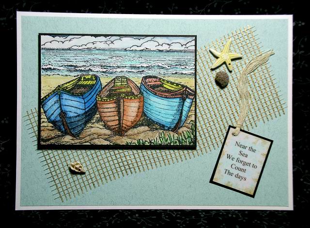
The boat scene (the stamp is entitled "On The Shore") is coloured with watercolour pencils, and attached to the card with foam pads. The mesh, shells and starfish are all very old stash. I knew I'd find a use for them one day! The text is computer generated, printed on to acetate and sponged with alcohol inks.


The next one, called "Picturesque", reminds me of various beaches I have visited, and I think it's going to become one of my favourite images. I coloured it with Promarkers and mounted it over a background which was embossed with a Cuttlebug folder and inked with Versamagic inks.. Again, computer generated text  and another very old starfish embellishment, with a recycled bit of string separated into its component strands to tie it all together. I'm feeling really good about getting some old stash used!


As well as the two stamps I've used in these cards, I also bought a new ISC set called "Mini Ledger", which I think is going to be very versatile, though I haven't made anything with it yet....

Innovative Stamp Creations is owned and run by the very talented Betsy Griffin, who calls her design team the Creative Architects Group. They all have many samples, using ISC stamps, on their blogs, links to which can be found here, as does Betsy on her blog. All worth a look. (FTR, I have no connection with ISC, other than that I like the stamps!)

Monday, 18 January 2010

Tuesday Taggers


Here's my entry for this week's Tuesday Taggers. It's 10 minutes to the deadline, so details to follow!!

..........

Well, I think (I hope!) I made it in time! The theme for this week was "Tag it with birds".  I'm pleased to say that all the materials on this tag are from my bit box! The background's done with alcohol inks, all stamps are by Crafty Individuals.

Saturday, 10 October 2009

Metal embellishments

Some years ago I bought some art metal. At the time it was being used mainly for embossing, by stamping or tracing on to it and then marking out the image with various tools & cutting it out with scissors. I wasn't impressed with the results, & the remainder of the pack has been languishing in a cupboard ever since. Until now!

Now there is the Cuttlebug! I found I could cut the metal with dies, eg. Nestabilities or Cuttlebug, and emboss it with the Cuttlebug embossing folders. And then colour it beautifully with alcohol inks or Promarkers. Voila!


The butterfly was cut with a Cuttlebug die, embossed with a Cuttlebug folder, and then coloured with alcohol inks. The patterned paper is My Mind's Eye, and the plain paper I have had for so long I can't remember where I got it!


The metal used for the swirl background on the lady card was gold coloured. I embossed it with the Cuttlebug D'vine swirls folder and then carefully inked over it with Brilliance Graphite Black ink, which I then heat set. So long as you do not press on too hard with the inkpad, the recessed swirls do not take the ink. The lady and wording stamps are from Hero Arts. I've had them for years, but they just seemed to fit with the swirl panel. The flourish is by Stampington.

So I have managed to use up some more old stash!

On the second butterfly card, I did even better. The butterfly is cut from a foil yoghurt pot lid, so it was free! The foil has a lovely texture and takes the alcohol inks very well. The inside foil cover found on some brands of margarine also works well. The new Cuttlebug Victoria folder provided a background for this card. The agapanthus stamp is by Stampendous, and the Birthday circles on both butterfly cards are from Craftwork Cards. The base card is pearlescent and it was quite difficult to photograph, but if you click on it to get the larger version, I think the detail will show up better.

Wednesday, 21 January 2009

Plum and Gold

This is my first ever card made specifically for a challenge, in this case the Graphicus Monthly Challenge. The colour scheme for January is Plum and Gold. I made the background with alcohol inks and Krylon gold pen, then stamped and embossed the fern leaf from the Elusive Images "Wild Meadow" plate. The same stamp was used on the edges of the card. The text was made with a label maker.

I really enjoyed making this card for the challenge, & look forward now to next month's!