Showing posts with label Be Creative alcohol marker pens. Show all posts

Sunday, 3 July 2016

July Challenge at Stamping Sensations

Well, it's time for a new challenge at Stamping Sensations, and we have what I believe will be a very popular theme for you this month!

* * * * * ANYTHING GOES WITH A STAMP AND RIBBON * * * * *

Who doesn't like adding a ribbon or two to their creations?! We're sponsored by the fabulous Crafty Ribbons, who have a superb range of ribbons, buttons, lace and more for your crafting needs. They have given us a fantastic bundle of ribbons and embellishments for this month's lucky winner.


I recently acquired the gorgeous new Bigz Butterfly 1 from Inkylicious, and couldn't wait to ink it up! I stamped it on to watercolour paper and coloured it with Be Creative alcohol markers, then masked it and sponged, stamped and stencilled the background. I added some shading around the butterfly with coloured pencil to make it stand out a bit. All stamps by Inkylicious. Tim Holtz Mixed Media die used as stencil. I mounted the finished design on to the base card along with a strip of patterned paper (PDA), sheer and satin ribbons, and pearl embellishments which I coloured with the alcohol markers to match the ribbon.

The base card is 7" x 5", which gives you an idea of the size of the butterfly, which is simply stunning.

In the knowledge that people will be busy with holidays and summer activities this month we've kept the theme nice and simple, so I hope lots of you will find time to enter for a chance of winning that gorgeous prize! We look forward to seeing your projects!

Sunday, 1 May 2016

Anything Goes!

Well, as you might suppose from that post title, our challenge theme this month at Stamping Sensations is

* * * * * ANYTHING GOES * * * * *

However, it could apply equally to the weather we're having at the moment!  I'm sitting here in my thermals, watching the rain pouring down the window, out of which I can see blue sky and fluffy white clouds just across the valley and snow on the distant hills! And it's the beginning of May!!!

Never mind, I'm sure we will get some fabulous entries to brighten things up. As always, although "anything goes" for our theme we do need to see stamping as the focal point of your project, since we are a stamping challenge.

Our sponsor for May is, once again, Crafty Individuals, who have donated a very generous £35 voucher for the lucky winner to spend in their online shop.


Their mix of products is beautifully eclectic, so whether you are into simple stamping, collage, mixed media, altered art, or styles from traditional to modern and quirky, you will find something in their range to suit you. For a long time now they have been one of my favourite stamp companies (not least for their fantastic customer service) so I had no hesitation in using their stamps and papers for my DT project this month.

Recently I went to a talk and demo of simple bookbinding given by the wonderful Glenda Waterworth. Glenda showed us some some stunning samples of her work. I came home feeling thoroughly inspired, and decided to make a (very simple!) accordion book.

I used mount board for the front and back, which I covered with Crafty Individuals background papers from their Springtime paper pad. The front cover is decorated with one of their newest stamps CI-452, a collage-type stamp from which I cut individual images and coloured them with Be Creative alcohol markers and watercolour pencils.


Continuing the Nature theme of the stamp, the pages of my book hold images from Crafty Individuals' Miniature Image Book "Nature's Beauty. Around each picture I stamped various images which help to tell its story. All stamps by Crafty Individuals. 


I really enjoyed making my little book! It has whetted my appetite for attempting something a bit more complicated, though I will have a long way to go before I produce anything as beautiful as Glenda's.

The DT have some absolutely gorgeous inspiration to show you over on the Stamping Sensations Challenge blog, and if you also check out their personal blogs it would be much appreciated.

I'm entering my book in the Crafty Individuals Blog May Challenge. Thanks for looking!

Sunday, 3 April 2016

One for the girls


My goodness, where did last month go?! Can't believe it's time for another Stamping Sensations Challenge already! But it is, and our theme this month is

* * * * * ONE FOR THE GIRLS * * * * *

Of course, you can interpret that however you wish, as long as your project includes a stamp (digis welcome as long as they are not pre-coloured) as the focal point of your project. As usual we have a terrific prize for the winner of our challenge, and making a very welcome return as our sponsor is PDA Card & Craft, who have donated a very generous £40 voucher to be spent online or, if you're local, in their store.


For my card I was inspired by one of the beautiful papers in the Dovecraft "Bohemian" 6"x 6" paper pad, which just happened to fall into my basket when I was in The Range the other day! I loved the colours and flowers, and it reminded me of the Crafty Individuals stamp I've used with it, which I thought would be very appropriate for the theme. Crafty Individuals stamps are available from PDA, and though I can't guarantee that they'll have this particular one in stock I'm sure they could order it if required.

I framed the Old Fashioned Girl with a Spellbinders die, to which she was attached with foam pads, and coloured her with Be Creative alcohol markers. She was matted on to the background paper with some Bazzill Basics card. I distressed the edges of all the papers. Finally I added some diecut butterflies. (Large - Frantic Stamper, small - Cheery Lynn).

There are lots of gorgeous girly samples over on the Challenge Blog, and my lovely teamies would be delighted if you would visit their individual blogs too, and maybe leave them a comment. Hopefully this will be a popular theme, and I will be looking forward to seeing lots of beautiful feminine creations! Thanks for looking!


Monday, 22 February 2016

Meet Autumn Fairy

The Be Creative design team have been working with Art Caps (bottle caps) and self adhesive Art Cap images from Once Upon A Stamp. I sat looking at mine for a while, waiting for inspiration to strike, then suddenly realised that they were saying to me "Art Doll".

Now, I've never made an art doll before, and I have to say it's not something I've ever previously felt an inclination to make. However, since that's what I was hearing in my head, I thought I'd better have a go, and so I'd like to introduce you to Autumn Fairy.

I didn't really know where to start, and with no clear plan in mind, she just evolved as I went along. I punched out the art nouveau image and stuck it into the bottle cap, and there was her face. Gradually her personality began to emerge. I made a wire frame and covered the torso area with some wadding to fill her out a bit. A rummage through my fabric scrap box produced some burgundy velvet, a piece of white silk, and some gorgeous leaf printed fabric which I bought in the USA in 1995, the remnants of which I've been hoarding ever since. It was the beautiful autumn colours in the fabric which had attracted me to it, and so what else could I name my lady but Autumn Fairy?

I coloured the white silk with Be Creative alcohol markers to match the leaf fabric and made it into a blouse for her. The red velvet became her skirt, with an overskirt of green irridescent ribbon which had once tied up a bouquet of flowers. I cut out some of the leaves and berries and stuck them to her blouse and skirt. She needed some wings, of course, and a Prickley Pear butterfly stamp with a design of leaves and wheat on it couldn't have been more perfect for them. I stamped it on to acetate, coloured it with Be Creative alcohol markers and cut it out.


To help her stand, I drilled a couple of holes into a block of wood which once held an old set of Judikins stamps which I had unmounted several years ago. I had kept the wooden cube as I just knew it would come in handy one day. I painted the cube with metallic acrylic paint and lightly distressed it with sandpaper. A few leaves, an acorn and a ladybird were added to give a hint of her woodland environment. Finally her legs were glued into the block, and thus Autumn Fairy was born!

Hmm. I think she doesn't look very happy. Maybe she needs a friend...............

Friday, 5 February 2016

News and New Stamps!

As a very proud member of the Be Creative Design Team, I'm delighted to announce that we now have our own Be Creative DT Blog, where we will be featuring our Be Creative projects and cards, along with hints and tips and product news. We'd love you to take a look at the new blog and become a follower. Justin has promised that when we reach 100 followers we can have a blog candy draw, so what's not to like?!

It's a close run thing, but I think my favourite Be Creative product is probably the alcohol markers, as they are such good quality and there is so much you can do with them. I've used them on the card I want to show you today.

Ever since I saw on Pinterest some stunning cards using Altenew stamps, just about all their floral sets have been on my wishlist! I managed to resist their lure for quite a while, but eventually gave in and ordered the Vintage Flowers and Painted Poppy. Couldn't wait to try them out, so here's my first card, using the Vintage Flowers.

As you will see, I need more practice in lining up the stamp layers, which I found quite tricky, but I think it's not too bad for a first attempt.

The roses and leaves were stamped with Versamagic inks in Sea Breeze, Turquoise Gem and Ocean Depth, and the small flowers with Versacolor Heliotrope, Violet and Grape. All other colouring on the card (except for the ribbon) was done with Be Creative alcohol markers.

Having completed all the stamping, I masked all the flowers and leaves. To make the speckled background, I scribbled the markers on to my glass mat and mixed the ink with Spray M Boss (Once Upon A Stamp), which has, amongst its many other uses, the effect of turning the alcohol ink into paint. I picked it up on an old toothbrush and flicked the paint on to the card, then removed the masks. I wanted the edges of the picture to be a bit darker, so I dabbed some ink directly from a marker on to a felt pad and stippled it around the edges.

The matting layers were cut from white card and coloured with the markers, as were the butterflies (Cheery Lynn dies). A little bit of sparkle was added to the small flower centres and butterflies with some Be Creative glitter glue. The border was cut with a Martha Stewart punch.

I love the versatility of the Be Creative markers, in that they can be used to co-ordinate all parts of a project. I don't know whether by accident or by design, but the two colours I used here, Pale Blue (which is actually purple!) and Peacock Green, perfectly match the ink colours Violet and Turquoise Gem! Probably coincidence, but a lucky one!

Anyway, I'm off to get some more practice lining up the layers. Think a MISTI would be very useful. Did I mention that's on my wishlist too...........?!

Tuesday, 26 January 2016

Fairy Nuff!

I started out with the intention of making a background with the Be Creative alcohol markers and then stencilling over it. However, the project had ideas of its own!

Here's the background. First I coloured the whole of it with one of the markers, using the chisel end of the marker, then dabbed various colours on to felt pads and stippled over it, mainly around the sides.


I left it to dry, and when I came back to it, it made me think of a secret glad in an enchanted forest. The vertical streaks were trees, and the stippled parts vegetation.So I had to turn it into a fairy card instead!


The gorgeous sentiment is by Visible Image, all other stamps by Inkylicious. I sponged around the edges with Memento ink (being water based it won't smudge the alcohol ink), with extra at the bottom to ground the fairy, toadstool and flowers, and added a few blades of grass with a Micron pen. The sentiment seemed to go with it all perfectly. Liberal application of Be Creative glitter glue provided the necessary sparkle!


Now what was it I was supposed to be doing.......?

Monday, 25 January 2016

Another tile

This time I stamped the poppies (Technique Tuesday) on to the tile with Brilliance ink and clear embossed it, stippled the background with Be Creative alcohol ink markers as in my previous post, then coloured the poppies with the markers. I rather like the stained glass effect.


Friday, 22 January 2016

Ceramic tile coaster

Had a few ceramic tiles lying around, so I thought I would try decorating one with the Be Creative alcohol ink marker pens.


I began by dabbing the markers on to a felt pad and stippling the ink on to the background. Then I simply hand drew the flowers and butterfly with the markers directly on to the tile. Easy peasy!

Here's a close up of the detail.

What's interesting is how the alcohol ink spreads on the tile, and how lighter colours will move aside darker ones. I'm not the best at drawing, but I wanted to see if the technique would work on the tile. I think it did. With more practice I would hope to be able to gain more control over how the colours move. On the other hand, I also quite like the random effect.

I'm quite pleased with my first effort at decorating a tile. I think it also shows the versatility of the markers.

Wednesday, 6 January 2016

Alcoholic jewellery!

Knowing that alcohol ink works well on glass, I decided to see what I could do with the Be Creative alcohol ink markers and some glass domed cabochons, which I then made into pendants. They were very easy to make.

The method was the same for each one. I used the markers directly onto the back (flat surface) of the glass cabochon, dotting the colours around, and they spread quite naturally into each other on the glass. I found that less is more with this technique. If you put too much ink on, it spreads too much, leaving areas uncoloured, though of course that may be a perfectly good technique if you like the end result! I wanted a bit more colour, although not too dark, otherwise the stamping wouldn't show through. When I was happy with the colouring, I made sure it was completely dry before stamping (again on the back) with Brilliance ink, which I heat set. I then added a little extra colour to the butterflies. I found out when making my prototype that even heat set, the Brilliance ink tended to smudge a little if I used the markers over the top of it, so when it came to colouring the butterflies, I was VERY careful to keep inside the lines! I had tried stamping first before any colouring, but when I tried to colour over it, most of the stamping rubbed off.

Here are the individual pendants. The butterflies and cow parsley are by Crafty Individuals, the buzzard by Inkylicious.


I backed the pendants with white card to stop the inks wearing off and help the colours to show through. I adhered the card with Be Creative Wonder Tape. However, for the bails I used  the recommended E6000 glue, as I wasn't sure how well the Wonder Tape would work with metal, although I'd hazard a guess it would be just as effective. I'll maybe try it on another one and see. The final step was to coat the back of the card with Ranger Inkssentials Glue N Seal to protect it.

I probably should make some gift boxes next ......


Post Christmas play!

Now that Christmas is over, I'm being creative again with Be Creative! Been doing some more experimenting with the alcohol markers, and also tried out the Wonder Tape. The alcohol markers are not yet on the website, but in the meantime you can order them by contacting the shop directly.

My first project of 2016 was a card, on which I used the alcohol markers, a tag, background papers and the Wonder Tape.

I had some foil tape in my stash, bought originally from a DIY shop to make my grandson a Roman spear, for which it worked very well! I thought it might also work well as an embellishment for cards, and wondered whether it would take the ink from the alcohol markers, and as you can see, it did!

The foil is very thin and delicate, so the first task was to stick a length of it on to some card. I found the best way to colour it was to scribble directly on the foil with the markers (I used 3 different colours in light, medium and dark shades) and then to blend the colours by dabbing very lightly (so as not to muddy the colours) with the ink blending tool to which I had added a drop of isopropyl alcohol (you can of course use alcohol ink blending solution if you have it, but you only need a very small amount).

Having coloured the foil I then embossed it with a Cuttlebug embossing folder and stuck it with Wonder Tape to another piece of card which I had coloured with the darkest shade I'd used on the foil. I do like how you can use the pens to make everything co-ordinate. I then trimmed it down to leave a narrow border on each side. The butterflies (Cheery Lynn dies) and sentiment panel were coloured with the markers in the same way as the foil. Sentiment is by Hobby Art.

With the exception of the butterflies, which were fixed with a spot of glue from the Be Creative glue wand, everything else was adhered with the Wonder Tape, which, I have to say, is every bit as good as it is claimed to be! Very easy to use, but you need to be accurate with placing it, as once stuck, it certainly isn't going anywhere else!

For my second project of the New Year I have been back in jewellery making mode, but I'll save that for another post!


Wednesday, 25 November 2015

How shall I colour thee? Let me count the ways!

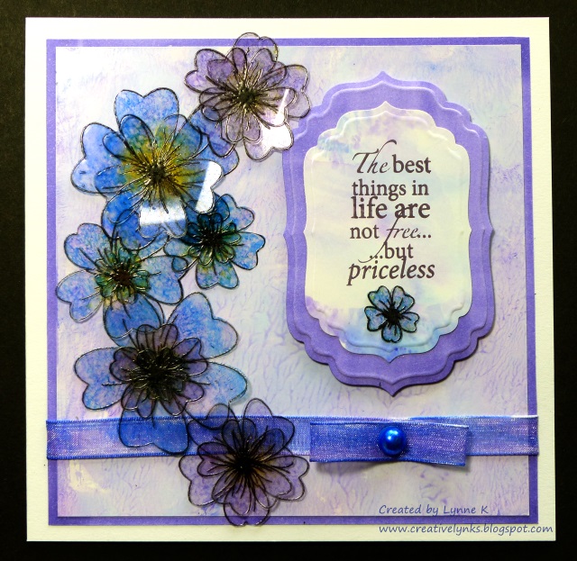
Here's a card. And before you scroll down to see how I made it, here's a question. How many different types of colouring media do you think I used on it?

 The answer is just one! I've been having a play with my Be Creative alcohol based markers, and I wanted to see if I could create a card using only those to colour all the various elements. Of course, I had to use a water based ink to stamp the flowers and sentiment otherwise they would have been smudged by the markers, but everything is coloured with the markers.

I stamped the flowers (Honey Doo Crafts) with black Brilliance ink on to heat resistant acetate, embossed them with clear embossing powder and cut them out. I coloured them by attaching a piece of felt to a Be Creative mini ink blending tool, rubbing ink from the markers on to the felt, and then dabbing it on to the flowers.

To make the main background paper, I scribbled some colours on to my glass mat, added a few drops of hand sanitiser and smooshed it around with my finger to swirl the colours together. Then I pressed a piece of shiny card (eg. encaustic art card) over it to transfer the colour. An added bonus, (depending on the brand of sanitiser!) is that your card will smell nice!

The next job was to make the background for the sentiment. Again, I used the glass mat method, but instead of the hand sanitiser I sprayed the colours lightly with isopropyl alcohol to merge them, which gave a smoother result. Alcohol ink blending solution would work well, but I didn't have any, and anyway, isopropyl alcohol is much cheaper. You can buy it from the chemist, but they may have to order it for you, and you may be required to explain to them what you want it for!

SAFETY NOTE! If using either the hand sanitiser or alcohol spray methods, make sure your work area is well ventilated and do not use near naked flames. Also please note I cannot be held responsible for any problem resulting from your use of my methods.

For the outer border and that around the sentiment I simply coloured a piece of ordinary white card with a marker.The ribbon was coloured in the same way using two complimentary colours. Finally I used a marker to colour the self adhesive pearl (Be Creative), stamped the sentiment (Woodware) with Memento ink and diecut it with Spellbinders Label 4 dies.


I hope my experiment shows the versatility of the Be Creative Alcohol Markers, and also that you don't need lots of fancy stash to create something beautiful!