Showing posts with label Clarity Stamp. Show all posts

Tuesday, 3 September 2013

Vintage Nature

Thanks to Brenda and her gorgeous projects (see here and here) using their products, I've recently become a fan of Nicecrane Designs, owned by the lovely Ignacio. Once I saw his gorgeous butterflies, I knew I had to have them, and on browsing the site I discovered so many more equally lovely designs. They are all in the form of downloads (instant gratification!) and many have a vintage feel.

Like Brenda, it is unusual for me to make cards with little or no stamping on them, but Ignacio's designs are so pretty, I had to make an exception for them! I ordered several sets, and Ignacio also very generously sent me some freebie sets too. (NB. I have not been asked to promote his products, I'm just telling you about them because I like them!)

Anyway, once I'd got them downloaded, I set to work to make a few cards. Now, I struggle with cards for men. Or rather I did! Nicecrane has some lovely Old Map images. They're sold as bookmarks, but I made mine into a card.

I did do a bit of stamping here! The base card was stamped all over with an old freebie map stamp from Craft Stamper Magazine, with the bookmark image matted on to a thin gold border and placed on top. I didn't want to detract from the image, so the only embellishment is a little sentiment banner. (Banner stamp:Waltzing Mouse, sentiment: Clarity Stamp, a freebie from a show.)

Nicecrane has several sets on a nature theme, which is right up my street. My favourite is called "Colorful Nature", with vintage-style images of birds and animals. I used the four bird pictures to make a set of cards. It looks as though I cut them out with a Nestie label die, but though I have one of those it was the wrong size, so I just cut away each corner with a round hole punch.


The eagle-eyed amongst you will spot just a teeny-weeny bit of stamping (a tiny border by Waltzing Mouse)! Apart from that, the images are simply mounted on to a background cut with Martha Stewart punch-around-the page punches, and each is matted on different coloured Bazzil card which I inked around the edges to continue the vintage feel. I think they make a pretty set.


Thanks for looking!

Sunday, 19 June 2011

Monograms - Less is More Week 20

Last week was the first time I didn't manage to get an entry in for the Less is More Challenge, so I was determined not to miss this week's. The theme is "Monogram". Bit of a tricky one, this! I only have one truly monogram stamp, the "D" by Stampers Anonymous. I set to work with it, stamping it on to a Nestie-cut circle with a scallop border, and carefully colouring it in. Then I went off to do something else before I mounted it on to a card. When I came back I decided to have a quick look at the other entries before I finished off my card. Imagine my surprise when I saw that entry No. 40, by Nellie, had  used not only the same stamp, but the same colours too! Spooky or what?! I hadn't seen Nellie's before I made mine. Here's mine, just so you can compare! (I'm not entering it!)


So, what else to do instead? A bit of lateral thinking was called for. This was the result:


Self explanatory, I think! (Eiffel Tower - Clarity Stamp; Arc de T - unknown; Paris minus the P! - from a Clear Choice set, Nestie rectangle.) Strictly speaking, a monogram shouldn't be part of a word, but it seemed to need the "aris" to balance the P, which looked as though it might topple over otherwise! So I'm hoping Chrissie & Mandi will let me get away with it!

Saturday, 5 March 2011

Story of an Ink Pad

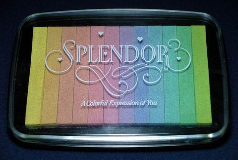
Many years ago, I bought the most gorgeous ink pad, I remember not where from. I think it was probably at a show somewhere. It's called "Splendor", a rainbow pad with twelve narrow strips of pigment ink in lovely pastel shades.


As soon as I saw that the challenge for Week 5 of Less is More is to use pastel colours, I knew just which ones I was going to choose. All of them!


This must be one of the quickest cards I have ever made! I used the ink pad as a stamp and simply pressed it gently down on to the card. I stamped the butterfly (Penny Black) and the sentiment (Clarity Stamp, I think, it was a freebie at a show) and that was it.

The Splendor ink pad was made by Tsukineko. It has been well used over the years, and a few years ago I emailed Tsukineko to ask them what colours I would need to re-ink it, as it doesn't say on the pad what the colours are. Sadly, I never received a reply. I've never seen any similar pads, and I guess they are long discontinued, but I was hoping that their current range of Versacolor inks would have equivalent colours. I could probably guess them, but the shading from one colour to the next is so delicate that I would hate to spoil it by getting the wrong colour.

I've just emailed Tsukineko again, although their website seems to be unavailable at the moment. I haven't heard of any problems with the company, so I will just have to keep my fingers crossed.....


Thursday, 13 January 2011

Any left-handers out there?

I made a card! My first of 2011! I wouldn't say I'm back in the groove quite yet, but at least it's a start. Although there's no lack of inclination - I want to do it - I'm still struggling to find motivation. I don't think they are one and the same.

Anyway, here's what I made. I really like the clean and simple cards which Joanne Wardle showed in her article in the October 2010 Craft Stamper, and which were so beautifully demonstrated by the Craft Stamping Quartet in their challenge showcasing Joanne's work. The link goes to Lesley Ebdon's post, but see also the three subsequent posts.

I also love the masked landscape technique which I first saw done by Barbara Gray a few years ago, and which I first tried back here. Recently there have been several people doing something similar, linking back to Heather Telford, who has some wonderful examples on her blog, including a tutorial. Do go and have a look at it.

I didn't want just to copy what other people had been doing, so I sort of combined the two techniques and came up with this:

I *think* it works - what do you think? To make the shape of the landscape I cut a mask out of acetate (so that I would be able to see where I was placing things) large enough to cover the card, and then sponged the design with VersaMagic inks and torn paper masks. The tree stamps are by Clarity Stamp, the small and medium versions. The landscape was made entirely with the small tree, using just the edge to stamp the little bushes. The larger tree and the sentiment (Personal Impressions) were then stamped with VersaFine ink.

I was quite pleased with the outcome, considering how long it is since I made anything, except for one thing. You can tell it's been a while. The finished card turned out like this!!


I'd totally forgotten to check which way the card opened before I started stamping on it! The perils of stamping straight on to the card! I was so annoyed! I thought the best way to redeem it would be to cut off the picture side and mount it on to another card, but that wouldn't be the perfect solution. Then it occured to me that it might just be appreciated as it is by someone who is left handed! I'll have to test the theory on a left handed friend......

Monday, 22 February 2010

Starting them young, and Allsorts Challenge week 40

Well, I had a great week up north, albeit exhausting! Needless to say, I didn't get any cards made, though we did have time for a bit of crafting. My four year old grandson had two birthday parties to attend while I was there (his social life is far more hectic than mine!) and he wanted to make cards for his friends. He decided to do some stamping, and here's what he made.


It was all his own design. He chose the inks and stamps (Clarity Stamp, Stampscapes, and Non Sequitur) and just got on with it. All I did was cut it out and mat it for him. I thought it wasn't bad for a 4 year old. He then decided he liked it too much to give it away! So he made a couple of other cards for his friends. 

I'm still trying to catch up after my week away, so apologies if I haven't managed to get round to everyone's blogs. I feel as though I've been out of circulation for ages. However, I did get a card made for this week's Allsorts challenge, whch is to incorporate a tag, ticket or label in the design.


I went for a vintage look. The background paper is old stash (Anna Griffin I think), overstamped with a Crafty Individuals text. I also used a Martha Stewart punch and Prima flowers. The flower centres are made with micro beads (very old stash!). The photo is of my maternal grandma. I was looking for something in my sewing box the other day and came across my thread cutter, the sort you are allowed to take on aeroplanes. I'd forgotten I had it. It's a circular blade set in a case which exposes parts of the blade, similar to this by Tim Holtz. I don't do so much sewing these days, and even less flying, so I thought my thread cutter would come in handy for distressing paper, and as you can see, it worked really well. And it's much prettier than Tim's!

Thursday, 21 January 2010

Allsorts Challenge Week 35 - Brown and Pink

Really had to think about this one, as brown and pink is not one of my favourite colour combinations. A bit too sickly for my taste. So I opted for scenic rather than soppy, hoping it might tone down the sweetness a bit.


I managed to use up a bit of old stash - the Stampbord, which I bought a few years ago and never did much with. I don't know why, it's brilliant for stamping on. I've got 64 small squares put away somewhere to make a chess board - if I ever get round to it!

Anyway, the background on the Stampbord is done with alcohol inks, and then overstamped with Versamagic. The border is a Martha Stewart punch, and the greeting by Craftwork Cards, mounted on a Nestabilities scallop circle. Stamps by Stampscapes (lake scene, heron, small rushes and birds on brown background), Clarity Stamp (trees on brown background), Art Impressions (flowers bottom left) and Craftwork Cards (rushes top right).

Friday, 4 December 2009

Oldie but Goodie

It's great to learn new techniques, and I am always on the lookout for new things to try, but sometimes it's good to revisit the old ones. I quite often go back to shaving foam marbling, simply because the results are good, and it's such fun to do. I like shaving foam particularly as a marbling medium because it is possible to have some control over your finished pattern. What you see in the tray is what you will get on your paper.


Thus, in the easel card shown here, I was able to make a landscape effect with more blue at the top and more brown at the bottom. The larger trees are from Clarity Stamp, and the deer and tiny trees in the background are by Stampscapes. The greeting is Inkadinkado. On the angel card I used a panel of marbled paper as a feature, stamped with  a Stampington stamp. The sentiment is also by Stampington. The angel is from the "Christmas" miniatures book by Crafty Individuals.


For the holly card, I revisited not only an old technique, but also an old stamp! It's from The Stamp Man. Having stamped it on the marbled paper, I embossed it with sparkle embossing powder & then coloured the leaves and berries with Promarkers to make them stand out more. I mounted it at an angle over a piece of printed paper. The message button is from Craftwork Cards.


The final card is very simple, just four squares of card, three stamped with a snowflake (Stampington), the other holding a Craftwork Cards message button, and strips of silver ribbon to finish it off.


Well, it was fun to go back to the marbling, but tomorrow Sally and I are off to the Open Day at Sir Stampalot, looking forward to seeing what's new, & also meeting Brenda. Can't wait....

Monday, 14 September 2009

Second childhood?!

Here are a couple of cards made with some of my new stash from Harrogate. Anyone who has read previous posts will know that I don't do cute. I must admit, however, that I do have a liking for fairies. Probably for the same reason that I like butterflies - they are such beautiful, ethereal creatures. A favourite book from my childhood, one which I still have (it's older than me!), is called "Once Upon A Birthday".


It tells the story of two children, a boy and a girl, who meet in Fairyland having been taken there magically to celebrate their respective birthdays. I loved it because it's full of gorgeous, colourful pictures of fairies. They have lots of exciting adventures in Fairyland, and in the end the little girl, once back home, gets a fairy outfit complete with wings for a birthday present, something I always wanted (particularly the wings!) but sadly never received!

Some time ago, at school, we had a reading week when staff were asked to take in a favourite book from their youth to read to a class. I took my fairy book, of course, interested to see what modern, worldly wise children, aged 5 to 7, raised on computer games and TV, would make of it. The story is strongly moralistic (eg. in one chapter a little fairy sulks because she lost a race in the school games, and her punishment is to come last in every game until she has learned her lesson, which she duly does) and quite politically incorrect. I was surprised, not to say delighted, that without exception they loved it. And, even more surprising, the boys did as much as the girls!

So what started this train of thought? New fairies from Lavinia Stamps! Lavinia Stamps are designed by Tracey Dutton, and her stand at the shows is always full of beautiful samples which are treats for the eyes. I was really taken with one card in particular. Check out her Gallery and you'll see it. This is my attempt to recreate it. I bought the Fairy, Vine & Secret Garden stamps at the show, and then filled in with others I already had, all Lavinia except for the trees on the left, which are by Innovative Stamp Creations. I would have bought the Lavinia Tree Root stamp also, but I'd run out of money by then, so I had to make do. I liked this fairy because she isn't too cute, and I love the air of mystery and magic about the "Secret Garden".


Still on the childhood theme, I couldn't resist these miniatures from
Clarity Stamp. I found the pretty ribbon at Harrogate too, but I'm pleased to say that all other materials on this card are old stash!

(The background paper, by Papermania, doesn't show up very well in the small photo - click on it to see the detail in the big one.)