What a day! On Friday we decided to have a last day out before I go back to school this week, and as we were heading up the motorway on the way to Robin Hood's Bay I got a text from
Sally. It said "You've won the Cuttlebug from the
Once Upon A Stamp Design Team Blog!" Well, I had to read it about six times before it sank in. Then I thought, no, it can't be me. Must be a different Lynne K. So I rang Sally, and she said "It's true! No other Lynne K entered the competition. I checked." Woo hoo!!! Now this sort of thing never happens to me, at least it never has until now. I've won the odd raffle prize occasionally, and even 2 sets of Elusive Images stamps, which was fantastic, but never anything like this. To say I was excited would be like saying the Titanic had a little prang with an iceberg - ie. understatement of the year! How I managed to contain myself for the rest of the day, I'll never know.
We had a lovely time at RHB. The weather was beautiful. We had fish'n'chips, a stroll along the beach, looked in the rock pools, found a few fossils, and enjoyed the fresh sea air.
Then we called on my sister-in-law who lives near Whitby. Home via the North York Moors with all the heather out. It was quite late when we got back, but I had to get the laptop out & see for myself - yes, it was true! I had won the Cuttlebug, along with the new "No More Shims" mat! First thing on Saturday morning I phoned Once Upon A Stamp, as requested, and arranged that, since I'm only half an hour from the shop, I could go up and collect it. Sally came with me.
I'd heard about the
No More Shims Embossing Mat, but didn't know all that it can do. It was invented by Gordon himself, and he kindly gave us a demo of its capabilities. I am highly impressed with it. Not only can you emboss through the CB without having to faff about with fiddly extra bits of card (and you get a better result), you can also emboss found objects as long as they are no thicker than a 10p piece. Magic! I tried some real leaves and they came out beautifully. So I made a gift bag to put them on.

The bag is made from an envelope, and it's very quick and easy to do. See the video by Lisa Spangler on the
Hero Arts website. The definition on the leaves is amazing. All the veins stand out, even the tiny ones. (Click to get the big picture and see them!) Having embossed them onto plain photocopying paper, as Gordon suggested, I cut them out and then sponged over them with various colours of pigment inks. I thought that doing so might squash them, being on thin paper, but the detail held very well. Then I matted them on to coloured card. The bag is stamped with Hero Arts stamps.

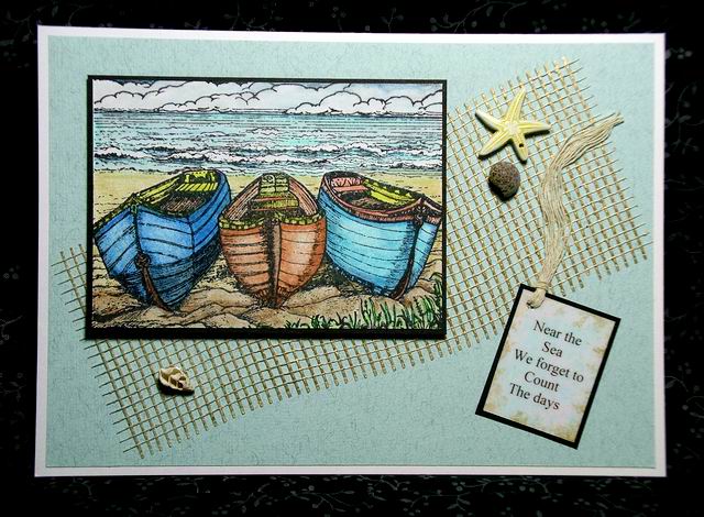
Next I tried embossing some mulberry paper which has a raised embossed pattern on it. Again, it worked really well. I decided to use the one with the flowery pattern and made a card with it, having coloured it with pigment inks to make the detail stand out.

I kept the card simple so as not to hide the background, and just added a
Crafty Individuals picture, a flourish (a Marianne Design die) and a Nestabilities label. (Sentiment - Papermania, tiny flower - Rubber Stamp Tapestry).
I've been a big fan of the Cuttlebug for a long time and wouldn't be without it, but have always wondered why they couldn't come up with something better than fiddly bits of card for embossing. Well, Gordon certainly has - and it's brilliant!
I want to say a HUGE thank you to Gordon, Robert and all the team at Once Upon A Stamp for such a wonderfully generous prize. Oh, and it all came in a fab tote bag, also part of the prize. While I was at the shop I bought a Scor-Pal ......... but that's another story!


 The first leaf, an ivy, was painted with turquoise and purple Lumiere paints (although the turquoise has come out more green in the photo) so I used some purple patterned paper to pick up the tones in the leaf, along with some black paper stamped with a Stampington flourish in gold Brilliance ink. However, when it was finished I decided I didn't like it. The background papers seemed to be competing with the leaf for attention. (Leslie's didn't! Maybe I just used the wrong papers. I'd love to put a copy of Leslie's original here, but I don't think copyright will allow it.) Anyway, I kept the next ones clean and simple.
 Oak.
Oak. Wild rose.


 The bag is made from an envelope, and it's very quick and easy to do. See the video by Lisa Spangler on the Hero Arts website. The definition on the leaves is amazing. All the veins stand out, even the tiny ones. (Click to get the big picture and see them!) Having embossed them onto plain photocopying paper, as Gordon suggested, I cut them out and then sponged over them with various colours of pigment inks. I thought that doing so might squash them, being on thin paper, but the detail held very well. Then I matted them on to coloured card. The bag is stamped with Hero Arts stamps.
  I kept the card simple so as not to hide the background, and just added a Crafty Individuals picture, a flourish (a Marianne Design die) and a Nestabilities label. (Sentiment - Papermania, tiny flower - Rubber Stamp Tapestry).

