Sunday, 27 March 2011

Celtic Inspiration

I'm a big fan of Celtic Art, and I've had a Celtic design laser-cut border (by Rayher) languishing in my stash for a long time, waiting for a suitable opportunity to use it. When I saw this week's Less is More Challenge, which is a sketch, I knew I'd found one.

I stamped the bottom third of the card with some Celtic text (Judikins), layered the border on to a black background, stamped the Celtic knot circle (source unknown), cut it out and added a scalloped border (with my Nesties) and a sentiment (Inkadinkado).


I wasn't sure at first whether to stick with black and white, or whether to add a bit of colour, because a lot of Celtic artwork is very colourful, but I decided in the end that my card would work better in monochrome.


It was a great sketch to work with, and one I'll probably use again.
 

Sally and I had a trip up to Once upon A Stamp on Saturday.  I bought some new Nesties, Labels 5, in preparation for the eagerly awaited arrival of some new stamps I've just ordered from The Stampman. They're made specially to fit the Nesties, and they've got butterflies on! What more could I possibly want? (Well, butterfly stamps to fit ALL my Nesties would be good - I've dropped a hint to Jill!) When I first saw the new stamps on Jill's blog I thought I must be in stamp heaven! I'm clearing a space on my desk so that I can get to work with them as soon as they arrive.....

Friday, 25 March 2011

A bit more ...... but not much!

Well, I sat down to make a Less is NOT More card (see previous post!), but when it came to it, I didn't put very much more on it! I think I must have become too used to the minimal style! Need more practice!

I made this card for my niece's birthday. She's not an overly fussy person, so it's probably best I didn't go overboard with it. I was lucky enough to be given a box full of bits and pieces recently. The after-school club at the school where I work had had several boxes full of cardmaking stash donated to them, but some of it wasn't really suitable for them to use. The teacher who runs the club asked me if I would like some! I didn't hesitate for long!

It was mostly paper and card, and embellishments such as the dress on this card. Not something I would have bought for myself, but seeing as I'd got it, I thought I would try and use it. It had a bit of rather naff string tied in a bow around the waist, so I took that off and added the pearls instead. I've just bought a couple of Darkroom Door background stamps, Floral, and Flourish. They're huge (cover the whole of an A6 card), and I've used the Floral one here, stamped in a pale pink Versamagic ink on a cream card.  Unfortunately it doesn't show up very well in the photo. You can see it a little better in the close up.

My camera doesn't seem to pick up creams and pale yellows very well. They come out a mucky looking grey! The spotty paper is by Papermania, with a Martha Stewart border punch and Nestabilities ovals. The sentiment is a very old one by Stamps Unlimited, who I don't think are around now.

It will be back to Less is More tomorrow, but after that.... I've just got some of the gorgeous new printed tags from Crafty Individuals, and they're definitely not clean and simple....


Tuesday, 22 March 2011

Not my forte!

Well, it had to happen, I suppose! The lovely ladies at Less is More have chosen the theme of "Masculine" for Week 7. Definitely not my favourite topic! Still, it's all part of the challenge, so here goes.

I really struggle with cards for men, probably because most of the men I know don't seem to go for typical male pursuits. So it's no good making them cards with footballs on, or beer glasses, or darts. Or even cars (unless camper vans count!) Anyway, I kept this one very simple - just a torn portion of an ancient text (Make Your Mark) and a column piece (Non Sequitur), with a sentiment by Anna Griffin. I'm not sure that any gentleman of my acquaintance will be likely to receive it! But there it is.

I really am enjoying these Less is More challenges. They certainly make me think. But after several weeks now of minimalism, I'm starting to get a bit of snow-blindness with all the white space! I'm getting the urge to go a bit wild with papers and embellishments, dies and decorations, ribbons and roses, borders and bling, and to fling as much on to a card as I possibly can! So watch this space! (Just until next week's LIM challenge, of course!)

Friday, 18 March 2011

Therapy!

Earlier this evening I spent a very restful half hour painting butterflies! I used to love "colouring in" when I was a child, and still do. I know I'm not the only one. There is definitely something therapeutic about it.

The butterflies were flying Off the Edge of the card, that being the theme for Week 6 of the Less is More Challenge. I couldn't resist a second entry this week.  The butterflies came from a little set which I bought some time ago in T**cos, (or it might have been S****burys, can't remember now. Nothing on them to say who made them). I painted them with Cosmic Shimmer paints. The two-tone effect of the paints is gorgeous, but unfortunately it doesn't show up on the photo. The sentiment is by Hero Arts. I could happily have covered the entire card with the butterflies, and spent all evening painting them, but since the challenge requires plenty of white space, I thought I'd better restrain myself!

Sunday, 13 March 2011

Footprints

I'd like to begin this post with a big thankyou to everyone who has commented on my blog.  I was thrilled to get 48 comments on my entry to Week 5 of the Less is More challenge, a record for one post for me, and I can assure you that every single one is much appreciated and makes it all worthwhile.

It's now Week 6 of Less is More, and they want to see a one layer card with the intriguing theme of "Off the Edge". My first thought was of footprints marching on to and off the page. Trouble was, I didn't have a footprints stamps, but I figured it would be a fairly easy shape to carve by hand, so I made one from an eraser. I did, however, have the perfect sentiment to go with it, from an Aspects of Design set by The Stampman. I've had the set for a while, but haven't had occasion to use the sentiment before, and it's one I really like. I stamped that first, then made the footprints walk across the page in different colours of Versamagic inks.


I think this is a great theme, and some of the examples already posted at LIM are fantastic. I feel a second entry coming on, if I get time this week!

Saturday, 5 March 2011

Story of an Ink Pad

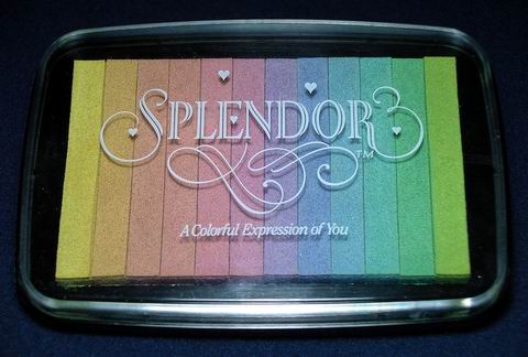
Many years ago, I bought the most gorgeous ink pad, I remember not where from. I think it was probably at a show somewhere. It's called "Splendor", a rainbow pad with twelve narrow strips of pigment ink in lovely pastel shades.


As soon as I saw that the challenge for Week 5 of Less is More is to use pastel colours, I knew just which ones I was going to choose. All of them!


This must be one of the quickest cards I have ever made! I used the ink pad as a stamp and simply pressed it gently down on to the card. I stamped the butterfly (Penny Black) and the sentiment (Clarity Stamp, I think, it was a freebie at a show) and that was it.

The Splendor ink pad was made by Tsukineko. It has been well used over the years, and a few years ago I emailed Tsukineko to ask them what colours I would need to re-ink it, as it doesn't say on the pad what the colours are. Sadly, I never received a reply. I've never seen any similar pads, and I guess they are long discontinued, but I was hoping that their current range of Versacolor inks would have equivalent colours. I could probably guess them, but the shading from one colour to the next is so delicate that I would hate to spoil it by getting the wrong colour.

I've just emailed Tsukineko again, although their website seems to be unavailable at the moment. I haven't heard of any problems with the company, so I will just have to keep my fingers crossed.....


Monday, 28 February 2011

Two more Awards

Well actually it's the same award, but given to me by two people. Thank you very much to Lynne and Sue for this honour. The conditions of this award are:

Step 1 - Make a post linking back to the person who gave you the award!
Step 2 - Share 7 random things about yourself.
Step 3 – Award 15 recently discovered bloggers with this award.
Step 4 – Contact these bloggers and tell them they’ve won the award.

Well, here goes with the seven random things.
1. I've been card making for nearly 20 years.
2. My first stamp was a little Hero Arts Santa Claus, and I still have it (and still use it!).
3. My favourite flowers are pansies.
4. When I was about 12 I played the piano on Yorkshire TV - in sound only! (It was a filler between schools programmes.)
5. I used to collect paperweights. (Had to stop when I ran out of space!)
6. I'm a Yorkshire exile (born in Leeds).
7. I once drove a Formula Ford single seater racing car.

I'm afraid I don't have time right now to find 15 recently discovered bloggers to pass on the award to (I think it is a bit unrealistic to expect people to do so with that many) but as and when I come across deserving blogs which are new to me I will pass it on then. Or if I have commented on your blog for the first time recently, please help yourself to the award.

Sunday, 27 February 2011

Less is More Week 4

The Less is More Challenge is going from strength to strength and I'm loving it! Week four asks for three squares. Sounds simple, but it isn't! Not for me, anyway! The problem is knowing where to stop. You wouldn't believe the trouble I had with this one, or how many attempts went in the bin. First of all I stamped three frames, and then three different flower squares inside, but the frames didn't look right. Too heavy. I tried a different frame. Same problem. So on the next try I hand-drew some wiggly frames. Getting better. I stamped a sentiment, but the script was too heavy for the frames. So I found another sentiment (Crafty Individuals) which was more in keeping. At last, I thought! But somehow I still wasn't happy with it. I left it in disgust and went off for my tea. When I came back and looked at it again, I knew what was wrong. I put it in the bin and started again. This time I used the same flower (Inkadinkado) in each frame, and I don't know why that should have made so much difference, but this time it worked! Or, at least, I was happy with it! Couldn't be much more CAS really!

Thursday, 24 February 2011

Essence of Spring

For week three of the Less is More Challenge, the theme is Spring. It was a doubly hard challenge for me this week, as I'm away staying with my daughter and family for the week, and the only supplies I have to work with are those in my "crafty box" (as my grandson calls it), which I keep packed with a microcosm of my stash for travelling.
It is, admittedly, quite a large box, but in comparison with my total stash, the amount it holds is extremely small! So it really was a challenge to find something in it to fit the theme.

Anyway, here's my card for the Less is More Challenge. And since it's all made from punched scraps, it will also fit Jules's Crafty Snippet challenge. (Sentiment by Inkylicious.)

I'm having a great time up in Dumfriesshire with my grandsons. They're keeping me busy, so I haven't been able to get round many blogs this week. Will try and catch up when I get home. The weather has been very grey and wet all week, apart from about an hour when the sun broke through the clouds this afternoon, but it hasn't bothered these two cool guys!


Sunday, 13 February 2011

Less is More Challenge Week 2

Getting back into challenges is helping the lack of mojo I've been cursed with over the past few months, I think. I'm loving Less is More.  For week 2 they would like to see one-layer cards with a flower or tree. Apart from the fact that I do like the clean and simple look, I also like the fact that it doesn't take long to make! My entry for this month's Sir Stampalot challenge (see previous post) took me all day yesterday to produce. This one (randomly sponged background, Hero Arts tulip and Darkroom Door sentiment) took less than five minutes!