Saturday, 13 July 2013

80 years young

Our choir conductor is a lovely lady who has just celebrated her 80th birthday, though you wouldn't know it to look at her! She doesn't seem a day over 65! I can only wish to have her vitality and joie de vivre when (hopefully!) I get to her age!  I wanted to make her a special card, and this is what I came up with.

 I used a Go Kreate die to cut the components for an easel card, which I covered with papers from Crafty Individuals' Background Papers pad Book 1. The lilac stamp (Toomuchfun Rubber Stamps) is one I've had for nearly 20 years! It was coloured with Promarkers and it and the sentiment (Inkylicious) were cut out with Spellbinders Labels 4 dies. I kept the embellishments quite simple, as I didn't want to cover up too much of the pretty papers.  The butterflies are made with dies by Cheery Lynn, and the flowers with the Small Multi Flower Rose Die by Britannia Dies.

 Here's a closer look at some of the details.


Here's the card in its box.

And here's the box.

The only brief I had for the card was "She likes pink and lilac"! However, I'm pleased to say that she liked it!

Haven't made much else lately. I'm wilting in the hot weather! I suppose we shouldn't complain, but just a few degrees cooler would be lovely! One of the things I've been planning to do in the school hols is reorganise my craft room. My younger grandson (aged 4), who likes to come & do crafty things with me, told me the other day that my craft room needs a good tidy up! (I have a sneaking suspicion that his mum might have said something similar to him about his toys!) However, I must admit he's right. The shelves are all mixed up and things have started to creep on to the floor. Time to make a start, I think.......

Sunday, 7 July 2013

Stamping Sensations July Challenge

For a change we have a sketch for you this month at Stamping Sensations, designed by our very own Tracy, and also we would like to see summer colours. You can combine the sketch with summer colours, or just follow the sketch, or just use summer colours, it's up to you!


Our lovely sponsor for July is the very popular Little Claire, who have generously donated a bumper prize, including some of their newest stamps!


I've used a Little Claire owls stamp (which just happens to be my all-time favourite owl stamp!) for my card. Or should I say part of the stamp. To make it fit with the sketch, I masked off the two outer owls before I inked it up.

The owls were coloured with Promarkers to match the colours in the background paper, which is from the Shades Of Summer Background Papers pad by Crafty Individuals.


 The circles (plain and scallop) are Spellbinders dies, the scallop border die is by Die-namics and the leaf punch is by Leone Em. A ribbon and some little pearly flowers provided the finishing touches.


I am really looking forward to seeing this month's entries! If you'd like the chance to win those gorgeous goodies from Little Claire, do pop over to the Challenge Blog, where my talented teamies have come up with some beautiful samples to inspire you. It's amazing how they are all so different considering we have all followed the same sketch!

Sunday, 30 June 2013

Citrasolv-ed!

Whilst browsing Pinterest one day recently, I came across some artwork that I really liked. Diffuse, mystical backgrounds, to which various elements had been added. I followed the links to see how it was done, and thus discovered Citrasolv art. It involved using a cleaning solvent (Citrasolv) to break up the inks in a printed picture, giving amazing effects!

Here's the Citrasolv website, where you'll find lots of info and examples.  

I couldn't wait to try it! The only problem was I didn't have any Citrasolv! It is, of course, an American product. Anyway, back in about 1995 while visiting the USA, I bought some stuff called Goo Gone. Like Citrasolv it is a citrus based cleaner, albeit made with petroleum distillates, which Citrasolv doesn't have. My American host was using some to get rid of the sticky mess left by labels when you try to get them off, and because at that time I had never found anything here which would do that easily, I bought some to bring home.
 
I didn't know whether Goo Gone would work in the same way as Citrasolv, but decided it was worth a try. I had about a third of the bottle left (been using it very sparingly!) First I tried it with an old magazine, but nothing happened. The inks didn't shift at all. Apparently many of the artists on the website use National Geographic mags, something to do with the type of ink and the fact that the photo pages are clay coated. So I scrounged a couple of old copies from my daughter.
 
They worked a treat! The Goo Gone produced some great papers, which I then scanned on the computer. Just wish I'd thought to scan the original photos too before I altered them, to compare. I'll remember next time! Since you'll never get the same result twice, it makes sense to scan your original altered pic, which you can then keep, and use a printed copy in your project. Once you've got your printed copy, you can then enhance it however you wish.

These are a few of the best results. 


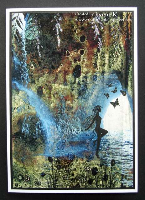
And here's a card I made with the first one. I used my graphics programme to add the butterfly (one of my own photos) , and stamped the sentiment (by The Craft's Meow).


To the second paper I added a stamped fairy, some leaves hanging down from the top (both Lavinia Stamps) and some tiny butterflies (The Craft's Meow). I used a fine drawing pen to turn some of the blobs into flowers, and enhanced some of the elements, including the fairy's wings, with glitter glue.


Knowing I would want to do more, (and by then having only a few drops of my precious Goo Gone left!) I went online to see if I could get hold of some Citrasolv. Found it on Am*z*n, and ordered some forthwith. 

There's a very good YouTube video by Cathy Taylor, one of the artists profiled on the Citrasolv website. Once you find that one, which is a good one for the basic instructions, it will then lead you to others. 

I haven't yet had time to try it with the Citrasolv, but I have high hopes for it! And if it doesn''t work, at least I have a replacement for the Goo Gone! 

Saturday, 15 June 2013

Hedgerows

The hedgerows and verges around here have been stunning this year. Masses of wild flowers and grasses stretching for miles. Cow parsley, buttercups, dandelions, comfrey, vetches, speedwells, bluebells, red campion and more. It was such a gorgeous day, one day last week as I was driving home from work, that I just had to keep stopping and taking photos.


I happened to look over the bridge over the river just in time to see a heron take off. (It's almost in the centre of the photo - you can see it better if you click on the pic to enlarge it.)

A sunset pic to finish off with!


Thursday, 13 June 2013

A great weekend

I went down to Nottingham last weekend to stay with Sally so we could go to Stamp Magic at the Doncaster Dome on Sunday. In other words, so I could get one of my twice yearly doses of crafty retail therapy! It began on Saturday with a little trip to Ik*a. Whilst there I noticed they were selling some lint rollers. Very cheap! On Pinterest I had seen a suggestion to use a lint roller to pick up all the fiddly little bits left in a die after you've been diecutting, so Sally & I both bought one, along with a pack of 4 refills. Suffice it to say, it didn't work! However, we now have enough roller tape each to keep our clothes free of bits until kingdom come!

Anyway, the serious shopping was on Sunday at Stamp Magic. Great show, as usual. Top of my list were some of the gorgeous new stamps from Inkylicious. I then left Sally doing a bit of demoing on the Inkylicious stand while I went for a wander round. I bought some stencils to use with my Gelli Plate, plus a few other bits and pieces, and watched Barbara Gray doing a great demo on the Gelli Plate. Haven't had chance to try what she was doing yet, but I have had a play with some of my new stamps.

One of my favourites from the new Inkylicious ones is called Poppy Lea. I like the way all the flowers except the poppies are solid, and just the poppies are open so that they can be coloured in. I happened to have some small pieces of watercolour paper already cut, so I stamped different sections of Poppy Lea on to each one and made a set of three cards.

 The backgrounds were coloured with Distress Stains, then Poppy Lea was overstamped with Versafine ink. The poppies were then coloured with Promarkers.  I stamped the first base card down one side with Delicate Vines, the second all over with Worn Paint, and the third with French Style Script across the centre. The Poppy Leas were then attached with foam pads, and each card finished with a simple sentiment. All stamps by Inkylicious.


On the way from the car park to the Dome, we came across this mother coot feeding her babies on the grass next to the lake, right by the path! They weren't a bit bothered by all the people walking past. Cute coots!


Sunday, 2 June 2013

Summer Blooms

There can't be many people who don't like flowers, so I think our June Challenge at Stamping Sensations will be very popular! The theme is

SUMMER BLOOMS

We have a wonderful sponsor this month too - Heartfelt Creations, who have given us a gorgeous prize. Some lovely floral stamps and a set of matching dies.


I decided to make a tag for a change, and have chosen a Dutch Iris as my summer bloom. The matching stamp and die sets are by Heartfelt Creations. (They don't appear to be on their web site now, but there may be some shops which have them in stock still).


Irises were my late mother-in-law's favourite flowers. She had them in her garden in various colours, one of which was a gorgeous deep purply pink. For the background to my tag (which is from Inkylicious), I used a technique shown by Andy Skinner in a video on his blog. He calls it Alcohol Ink Floating Background. Very easy to do, and a lovely subtle marbled effect. I overstamped it with a Texture Fragment stamp and a Floral Edge stamp, both from Chocolate Baroque, and a text stamp by Stampin' Up. The little butterflies are also by Chocolate Baroque, and they and the iris were coloured with Derwent Inktense pencils (which I found at Dunelm Mill last week for half price - a bargain - and I love them!). Having sponged ink around the edges of the tag, I matted it on some green card and finished it off with a sentiment by Hobby Art, some ribbons and fibres and a bit of lace. 

My talented teamies have some bloomin' gorgeous samples for you this month! Do go over to the Challenge Blog and have a look at them, and then show us your summery projects. We can't wait to see them!

Saturday, 18 May 2013

Otter video

My husband managed to capture on his phone this video of the otter playing in the river! Only glimpses of it (you can see it a bit better in full screen mode), but one day I hope to get a better one!


Sunday, 5 May 2013

Floating.....

Yes, I know, two posts in one day from me must come as a bit of a shock! However, I came across a rather gorgeous background technique on Pinterest and couldn't wait to try it out. It's called reinker float. Basically you emboss a design on to your card, soak it with water and then "float" the reinkers on the water so that they spread and merge. I won't go into all the details now as you can see just how to do it in a tutorial by Selene Kempton here.


I don't have any "shimmer white cardstock" (which Selene recommends and which I presume is from Stampin' Up), so I used some pearlescent card which seemed to work fine. (Bought it a long time ago so can't remember exactly what type it is, but I think it was from PDA and the colour is "ice white".) The main criterion is that the card should hold the water on top rather than absorbing it. 

Most times when I try a new technique it takes several goes before I master it to my satisfaction, but I'm actually quite pleased with my first attempt at this one! Of course it helped that it was easy to do! Using the pearlescent card gives it a lovely shimmer, almost mother-of-pearl like. The photo doesn't do it justice. 

The flower stamp is by Technique Tuesday. I stamped it with Versamark ink and embossed with clear powder (you could also use white powder but I wanted the sheen of the card to show through). Having thoroughly soaked it, I then dropped on Distress reinkers (Dusty Concord, Shaded Lilac and Antique Linen).  The card didn't need much besides the flower panel to finish it off. (Sentiment by Technique Tuesday, butterfly by Justrite, paper flower by Prima.)


I had avoided joining Pinterest until very recently, knowing that if I did I would end up spending quite a lot of time there! However, I've succumbed, and I'm so glad I did! There is so much inspiration out there and my boards are filling up very quickly. That's why I wanted to give this a go straight away rather than spend so much time browsing that I never got round to making anything. Must keep that thought in mind.......

Stamping Sensations May Challenge

Well, at last it's beginning to feel a bit more like spring up here! I'm looking out of my craft room window on to a bank of beautiful daffodils across the road. They were at least three weeks later opening than last year. It's even getting warmer - we only need two jumpers on now instead of three! Roll on summer, though, we need more sun!


Anyway, we have a lovely new challenge for you at Stamping Sensations, and our theme is

***** EMBOSSING AND TEXTURE *****

Any kind of embossing will be acceptable, dry or heat embossing, and there is endless scope for adding texture to your projects.

Our sponsor this month is the fabulous Tonic Studios, who have donated an awesome prize! A Peruvian Lily Stamp and Punch set and a gorgeous lattice window die, both from the Pick of the Bunch range designed by our very own super-talented Ruth Hamilton!


What a gorgeous prize! I want one! The Punch and Stamp sets really are stunning. Just imagine creating a lovely window box full of flowers in front of that lovely lattice window.

So, on to my card. I have incorporated both types of embossing.

The dry embossing helps to create the texture, as do the layers and embellishments. I stamped the fuchsia (from Tonic Studios' Pick of the Bunch range by Ruth) and heat embossed it with Wow! Neutral Ultra Shimmer embossing powder, which has a gorgeous sparkle. You can just about see it in the next photo. It was then coloured with Promarkers and cut out with a Nestie Labels 4 die. 

It is sitting on a background dry embossed with a Cuttlebug embossing folder. The left hand side of the background has a lily (also from the Pick of the Bunch range) stamped over Gelli printed paper. The join is covered with a strip punched with a Tonic Studios border punch. The diecut butterfly is by Cheery Lynn, and the sentiment by The Craft's Meow.

My lovely teamies have some absolutely gorgeous samples for you this month, so do pop over to the Challenge Blog where I'm sure you'll be inspired!

Thursday, 2 May 2013

At last!

There are otters in the river here, and although I've seen them occasionally, I've never managed to get a photo of one. Until today! Just beyond our back garden there is a steep bank which goes down to the river. Went out into the garden this morning and there was the otter, swimming and diving, looking as though it was playing without a care in the world! I rushed back inside to get the camera, by which time the otter had moved upstream, so I went into the field next door and just managed to get the photo before it went too far away.

I don't think there can be many people in this country who can see otters from their back garden. We are so lucky to live here. A lovely start to the day.