Showing posts with label Memento Ink. Show all posts

Wednesday, 16 December 2020

An Announcement!

 It was just an ordinary Wednesday afternoon. I'd been making a few Christmas cards, and watching Jean Hardy's Facebook Live on the Crafty Individuals Facebook Page, when my phone pinged. It was a message from Jean, asking me if I would like to join the Crafty Individuals Design Team! It took a few seconds to sink in. What? Who, me?? Really?? Then the excitement set in! Wow! Crafty Individuals was one of the first British stamp companies I bought from, many years ago, and they have always been right up at the top of my list of favourites! To be on their DT would be a dream come true! I was so excited! I thought I'd better ask Jean for some time to think about it, because I didn't want to make a commitment unless I was sure I could fulfil it. Jean said that was fine, so I had a think, and about 5 seconds later messaged her back to say yes please! Did I say I was excited?!!

The next development was the arrival of a parcel of the newest stamps and papers! They are all fabulous (you can find them here) and I was so excited to get to play with them. Did I say I was excited?!!

Here are some of my first makes as a DT member! My favourite of the new stamps, which have all been designed by Sharron Bates, is the wonderful "Of The Sea" (CI-559), which is an old boat with a lovely vintage feel. I thought it would make a suitable subject for pyrography.


I stamped the image with Memento Desert Sand ink on to Cass Art 300gsm hot press watercolour card, a good strong card with the ability to take the heat of the pyrography tool. I then used the tool to outline and shade the image. I overstamped one of the papers from the new "Wonderfully Weathered" Set 1 with some text from CI-397 before mounting the image over the paper. I added a few elements from CI-397, CI-272 and CI-349 to complete the project, which is a free standing plaque. Here's a close up of the lovely old boat.


My next play was with the gorgeous "Flower" CI-560, Sharron's stunning interpretation of a cone flower (aka Echinacea). I decided to make a journal. 


I made front and back covers from mountboard and covered the outside of them with papers from the "Aurora Borealis" A4 background paper set and the insides with one of the designs from a brand new paper set "Vintage Style Journaling Papers". The pages are a mixture of watercolour card and black cartridge paper, as you can just about see in the next photo. The covers and papers were bound together with my Bind-It-All machine.


Next, the flower was stamped on to encaustic art card, clear embossed, watercoloured and covered with Ranger Glossy Accents to seal it. Then alcohol inks were sponged over to make a background. An aperture was cut from a piece of textured card with a die from The Works, the image affixed behind it and then matted on to contrasting card to frame it. This was then adhered to the front of the journal, along with a book plate holder which has been in my stash for years! The wording inside it was computer generated. 


My final show-and-tell for now is the utterly fabulous "Pablo the Penguin" CI-557! I had finished all my Christmas cards, so I made a gift bag instead and put him on that.


I stamped Pablo, various elements from CI-257 and CI-326 and the snowflake (which I think was a freebie) onto fabric with Versacraft ink, which I heat set, and then added colour with Arteza fabric pens, which also needed to be heat set. I fringed the edges of the panel and stitched it to the front of the bag. I was quite happy with the result, but felt it needed just a little something else to finish it off. Had a rummage through my stash and found some tiny bells, which I attached to his antlers. Perfect!

Here he is in all his glory!


I've loved working with these fantastic stamps, and have more ideas for future projects, so thanks for looking, and watch this space!

Tuesday, 3 November 2020

Feathers and Paint

I've been playing with some stunning new stamps from Crafty Individuals,  Dawn Serenity and Dawn Hideaway. They were designed by Sandma, who combined various existing Crafty Individuals stamps to make these gorgeous scenes. They are all beautiful, but my favourite is the kingfisher, not only because they are amazing birds and I love their colours, but also because they were my late father's favourite birds too, and they remind me of him every time I see one.


I made an easel card for the kingfisher. The lake scene behind it was created with masks and Memento dye inks, the distant birds being hand drawn. The foreground grasses and the butterfly were stamped separately, cut out and adhered to the upper part of the card. The kingfisher was likewise stamped and cut out, then coloured with Arteza coloured pencils and fixed to the card with foam pads. A stamped sentiment provided the stopper for the card. All stamps used are by Crafty Individuals. The background papers are from my own photos of peeling paint on some old forestry machinery, which had the most wonderful colours and texture. 


My second card shows the lovely robin.


The background for the scene was created first, again with masks and dye inks, then the robin scene was stamped over it. It was stamped a second time on plain white card, the robin was cut out and coloured and adhered over the top of the first one. The sentiment is also by Crafty Individuals, and the background paper is another of my peeling paint photos.

These stamps have gone straight into my list of all time favourites. There are two more in the series, so watch this space!

Here's a photo of some of the old forestry machinery, which I am reliably informed are ditch diggers!


This is one of the original unedited photos of the paint. I have edited the photos for use as backgrounds.


It was a dull, damp day when I saw the old machinery, and I wasn't expecting to get much in the way of decent photos. However, a closer inspection revealed the possibilities! As well as the rust and peeling paint, various mosses and lichens added even more texture. Just goes to show that even if the bigger picture doesn't look promising, it's always worth checking out the details! 

Saturday, 18 April 2020

And More Rainbows!

We're midway through the month but there's still plenty of time to enter our April Challenge at Stamping Sensations, where our theme is "Somewhere Over The Rainbow", quite appropriate at the present time. Full details over on the challenge blog.

I've been taking advantage of the extra spare time, during this period of lockdown, to explore some different artforms, one of which is pyrography. I bought a kit a while ago but hadn't had much chance to try it out until now. I've been inspired by Richard Dickson who, as The Pyronautist, does some fabulous work. Do go and have a look at his Facebook page. He mentioned on his page that he had been burning designs on watercolour paper, which made it possible to produce cards with pyrography designs, so I thought I would have a go at that. It works a treat!

I stamped the flowers (Woodware) on to the watercolour card with Desert Sand Memento ink, and then outlined and shaded the design with my pyrography tool. I wanted to add the rainbow background but didn't want the flowers to be coloured, so I used a Versamark pen to cover them completely and clear embossed them to act as a resist.

I sprayed the card with clean water and brushed various shades of Distress inks over in a rainbow shape, drying it with a heat gun so that the colours didn't continue to spread. I wiped away the excess colour from the flowers with a damp cloth.

The watercolour card, which I thoroughly recommend, is Cass Art Hot Press 300gsm. It's called "paper" but 300gsm is actually quite thick, more like card. I don't think I would want to risk burning on to anything thinner! It also takes the water very well and is perfect for stamping on as it is smooth. I wanted to keep the design clean and simple, so I just added a die cut butterfly (Cheery Lynn) and a sentiment (magazine freebie). For a first try, I was quite pleased with how it turned out, and will definitely be doing more.

We have had some absolutely gorgeous entries for our Rainbow challenge so far, but we would still like to see lots more. Let's fill blogland with this symbol of hope!

Sunday, 5 April 2020

Rainbows!

I do hope you are all staying safe and well in these uncertain times. We crafters are very lucky to have our hobbies to keep us busy, and we hope you will be able to join in our April challenge at Stamping Sensations, where our theme is

* * * * * SOMEWHERE OVER THE RAINBOW * * * * *

Although the theme was chosen quite some time ago, it has proved to be very apt at present as rainbows are seen as symbols of hope, and many children recently across the UK have been drawing rainbows and putting them in their windows to cheer passers by.

As the title suggests, you can take inspiration from the song or you can use the colours of the rainbow in your project (or both!) but the focal point of your entry must reflect the rainbow theme.

We are sponsored once again this month by BeCreative, who will be giving our lucky winner a fabulous £25 voucher to spend in their online shop.

I've chosen to be inspired by the colours and by the song. Singing is a great thing to do, and it is proven to be beneficial for both physical and mental health. I think the Italians, in lockdown, singing from their windows and balconies recently, had the right idea!

I began my project by using my ink dusters to brush various Memento inks through the music stencil to make the rainbow background. I stamped the singer on a separate piece of card, cut her out and adhered her to the rainbow panel with foam pads. The sentiment was stamped directly on to the panel, which was then matted first on to purple card and then on to a 6" x 6" base card. This was a very quick and easy card to make. The stamps are by Visible Image and the stencil is by Bee Crafty.


I am extremely lucky to live in a beautiful rural area, and am able to take my daily walk along the banks of the river which runs by our house. It is so quiet and peaceful there, the only sounds being the rippling water, the birds singing, and the wind in the trees. Truly special! I thought you may like to see a few photos from one of my recent strolls.


My teamies and I are so looking forward to seeing your rainbow-themed projects! I'm sure you will have no trouble at all in deciding what to make, but do go and have a look at the gorgeous examples which we have for you over on the Challenge Blog, as one can never have too many rainbows in one's life, and we certainly are in need of something to cheer us all up just now. Stay safe everyone!


Sunday, 3 November 2019

Red, Green, Gold

Well, it's that time of the year again, you know, the one where I start to panic because it's November and I have made the grand total of 3 Christmas cards! I start the year with the best of intentions to do a few each month, but somehow that never happens. I do manage to get them done in the end. If only it could be in an atmosphere of calm relaxation instead of a frantic rush ! Oh well, maybe next year.....

Were it not for this month's Stamping Sensations Challenge, my grand total thus far would have been two! However, our November theme is to use

* * * * * TRADITIONAL CHRISTMAS COLOURS * * * * *

and so my sample became Christmas card No. 3!

We would like to see your projects in the traditional colours of red, green and gold. You may use any or all of those colours, but the main focal image must be stamped and reflect the theme, otherwise it will not be eligible. This month we are delighted to be sponsored again by Chocolate Baroque, who have very kindly donated these two gorgeous stamp sets for our lucky winner.

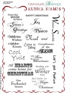
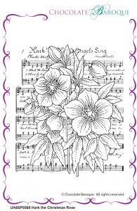
         Let's Get Festive Rubber stamp sheet - A5    Hark the Christmas Rose individual unmounted rubber stamp  - A6

I have used the beautiful Christmas rose stamp for my card.

I used the no-line colouring technique, stamping the image with Desert Sand Memento ink, and colouring it with Arteza coloured pencils. I cut it out with a Spellbinders die, sponging a little red pigment ink around the edges before I removed it from the die. I covered the base card with a background paper by Dovecraft, mounted the image to it with foam pads, and added some tartan ribbon, die cut sentiment (Britannia Dies) and holly sprig (magazine freebie) to finish it off.

I love hellebores, they are such elegant flowers, so the Christmas rose is one of my favourite Chocolate Baroque stamps. It's lovely to colour, and in fact I did manage to have quite a relaxing hour or so doing it! Here's another close up.


I must admit to being a bit of a traditionalist when it comes to Christmas, so I am really looking forward to seeing lots of entries in those Christmas colours. I'm sure you won't have any trouble coming up with ideas for this theme, but do go and have a look at my teamies' samples on the Challenge Blog anyway, just to feast your eyes on their loveliness. Meanwhile, I had better make a start on card No. 4........

Friday, 18 October 2019

The Leaves Are Beginning To Turn...

...but there's still plenty of time to enter our October Challenge at Stamping Sensations, where our theme is Trees and/or Leaves and/or Autumn.

This time I've used a stamp by Penny Black. I stamped it with Memento "Desert Sand" ink so I could use the no-line colouring method. I coloured the image with my Arteza coloured pencils. Background paper is by Dovecraft, sentiment by Inkylicious. Silk ribbon and button from my stash.

The challenge runs until 30th October, and my lovely teamies have even more gorgeous inspiration for you over on the Challenge Blog. We have some beautiful entries already; why not add yours and be in with a chance of winning a fab £25 voucher from our sponsor Stamp Addicts. Please just remember, though, that the focal element of your project must be stamped and fit the theme, otherwise it will not be eligible for the prize.

Sunday, 3 December 2017

Winter Trees and Flowers

It's time for the final challenge of 2017 at Stamping Sensations, and our theme for December is

* * * * * WINTER TREES AND FLOWERS * * * * *

Last month's theme of one layer cards seemed to be a little too challenging for some of you, but this month we hope you will find it easier, and you can layer and embellish as much as you like!

However, please do remember that we are a stamping challenge, therefore we must see stamping as the focal point of your artwork - ie. stamping must be the central point of attention and interest.

We have a fab prize from Stix2 for our winner, with a smaller prize for second place.


I chose a winter trees stamp from Circa Design (Unmounted Stamp Company) for my main image.

The pheasants, fox and kestrel are by Hobby Art, and the sentiment is a freebie from Simply Cards & Papercraft magazine.

I used a punched circle to mask where I wanted the sun to be, and also masked the top and bottom of the card, and everywhere below the line of the hill before colouring the sky with Memento ink using ink dusters. I then reverse masked the sun and coloured that too. I removed the hill and sun masks, stamped the tree scene and added some shading to give the effect of snow. I had to extend the trunk of the tree covering the right hand side of the sun, with a fine black pen, otherwise it would have appeared suspended in mid air!  Finally I removed all other masks and stamped the fox, kestrel and sentiment. The pheasants were stamped on a separate piece of card, coloured with Zig Clean Color pens, cut out (minus a few extra lines which I didn't want to show in the picture) and glued in place.

As always, if you're not quite sure how to interpret the theme, or just need some ideas, pop over to the Challenge Blog, where my teamies have created some wonderful samples to inspire you.

The run up to Christmas is always busy (and I still have several more cards to make!) but I do hope you will be able to find time to join in the challenge. It needn't take long, or be complicated, and the closing date is not until until the 3rd of January. A bit of quiet card making time between Christmas and New Year will be the perfect antidote to all the stress of the big day!

Saturday, 18 February 2017

Mid-month Inspiration at Stamping Sensations

The DT's current mid-month theme at Stamping Sensations is "My go-to stamp", and I have to admit that my heart sank a little when I saw it! For me, trying to pick a go-to stamp is like attempting to choose a favourite piece of music - there are so many I like and all so different. How do I narrow it down to one above all? Well, if I have to decide, I guess it must come down to trees or butterflies. And as this month's challenge theme is Animal Magic, I've gone with a butterfly. It's by Hero Arts and I have it in three versions: the original rubber, clear (in a set), and a rubber cling which is part of a Sizzix Framelits set. Oh, and a digi version! Sadly I think they are all now discontinued, but some occasionally pop up on eB*y.

The original one is one of my oldest stamps, but I still use it a lot, often as an embellishment to something else. This time, however, I decided to let it take centre stage, which, since it is so pretty, it certainly deserves to do. And it's wonderful to colour.

I made a background by dusting with Memento inks and overstamping the butterfly in two colours. Then stamped the butterfly again on white card, coloured it with Zig Clean Color pens and cut it out and matted it with Spellbinder dies. Sentiment by Stampingallday. Here's a closer look.

There's still time to enter our Animal Magic challenge, with a fabulous prize from sponsors Tattered Lace. Thanks for looking!

Sunday, 5 June 2016

Creature Comforts!

Well, best laid plans and all that! I should, when this post goes live, have been down at Sally's and getting ready to go with her to Doncaster for some retail therapy at our favourite show - Stamp Magic. However, a particularly nasty virus has put paid to that! I'm fortunate that I'm rarely ill with anything like this, so it's sheer bad luck that I should get it this week, and very annoying! I've had to send Sally my shopping list (thanks, Sally!) but will really miss having the chance to watch all the demos and marvel at new stuff, not to mention meeting people and soaking up the fantastic atmosphere which is the hallmark of Stamp Magic.

However, it's also time for a new challenge at Stamping Sensations, and at least I can take comfort in the fact that we have a great theme for you this month, and a truly fantastic prize! Our topic for June is

* * * * * FEATURE A CREATURE * * * * *

Plenty of scope here, but please do remember that as we are a stamping challenge, your entry must use a stamp (rubber/clear or non-pre-coloured digi) as its focal point.

We are sponsored once again by the fabulous Be Creative, who make an extensive range of innovative and exciting products for your crafting. One of their latest releases is the amazing WONDER CRYSTALS, a set of which will be included in the stash going to the very lucky winner! These extra thick embossing crystals are simply stunning, and they sold out on their recent introduction on Hochanda TV, so if you want to get your hands on some, here's your chance!

For my card, I was inspired by the beautiful heron which we see regularly by the river next to our house. The sentiment I've used (Chocolate Baroque) is particularly appropriate, because the heron will often sit for hours at a time on a tree branch which overhangs the river. Sometimes it will be preening itself, sometimes just watching......

My heron is a stamp by Inky Doodles. I've coloured him with Be Creative Alcohol Markers. He's watching over a lake scene created with Inkylicious ink dusters, masks and stamps, and Memento inks. The background paper is by Be Creative, from their Nature's Portrait 8"x 8" paper pad, which, along with all their other pads, is on special offer (half price!) at the moment.

This is always a popular theme, so I am hoping to be able to sit back, put my feet up and have lots of wonderful projects to peruse whilst I recuperate! Thanks for looking!

Tuesday, 26 January 2016

Fairy Nuff!

I started out with the intention of making a background with the Be Creative alcohol markers and then stencilling over it. However, the project had ideas of its own!

Here's the background. First I coloured the whole of it with one of the markers, using the chisel end of the marker, then dabbed various colours on to felt pads and stippled over it, mainly around the sides.


I left it to dry, and when I came back to it, it made me think of a secret glad in an enchanted forest. The vertical streaks were trees, and the stippled parts vegetation.So I had to turn it into a fairy card instead!


The gorgeous sentiment is by Visible Image, all other stamps by Inkylicious. I sponged around the edges with Memento ink (being water based it won't smudge the alcohol ink), with extra at the bottom to ground the fairy, toadstool and flowers, and added a few blades of grass with a Micron pen. The sentiment seemed to go with it all perfectly. Liberal application of Be Creative glitter glue provided the necessary sparkle!


Now what was it I was supposed to be doing.......?

Sunday, 3 January 2016

Happy New Challenge!

Happy New Year everyone! Our first challenge of 2016 at Stamping Sensations is a nice easy one for you!

* * * * * ANYTHING GOES WITH A STAMP AND DIE/S * * * * *

You choose the subject, we just need to see one or more diecuts and as always, as we are a stamping challenge, some stamping on your creations.

I seem to recall that one of my crafty resolutions for last year was to try and use up old stash. As you'll see from my project, I'm still trying!
Whether you're like me and have past purchases that need to be employed, or whether you received some lovely new crafty goodies for Christmas which you can't wait to try out, you could put them all to good use by entering our challenge this month! And just in case you need any further persuasion, we have an amazing prize on offer!


Our fab sponsors Tonic Studios have kindly given us the full range of their new colours of NUVO Crystal Drops (which are similar to Liquid Pearls) along with pots of glitters for the very lucky winner! Who wouldn't want to add those to their stash? I could definitely make room for them!

Anyway, on to my card. The weather has been so depressing lately that I decided to make something to remind myself that this dismal season won't last forever!


My stamp is from the "Picture Perfect 2" set, and the sentiment from the "Spring Awakening" set, both by Inkylicious. The main image was framed with Spellbinder dies, the sentiment was hand cut. I coloured the background of the image with Memento inks using Inkylicious Ink Dusters, masking each section of the image in turn.

The tree die (my new favourite die!), which I cut twice, is by Frantic Stamper (available from Once Upon A Stamp). The background is embossed with a Cuttlebug embossing folder.


I finished the design with some ribbon and some tiny leaf embellishments which have been in my stash for years!


The DT have some gorgeous inspiration for you over on the Stamping Sensations Challenge Blog, and remember you can enter up to three times with any type of cards/projects. Good luck!

Wednesday, 25 November 2015

How shall I colour thee? Let me count the ways!

Here's a card. And before you scroll down to see how I made it, here's a question. How many different types of colouring media do you think I used on it?

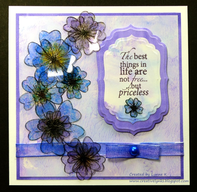
 The answer is just one! I've been having a play with my Be Creative alcohol based markers, and I wanted to see if I could create a card using only those to colour all the various elements. Of course, I had to use a water based ink to stamp the flowers and sentiment otherwise they would have been smudged by the markers, but everything is coloured with the markers.

I stamped the flowers (Honey Doo Crafts) with black Brilliance ink on to heat resistant acetate, embossed them with clear embossing powder and cut them out. I coloured them by attaching a piece of felt to a Be Creative mini ink blending tool, rubbing ink from the markers on to the felt, and then dabbing it on to the flowers.

To make the main background paper, I scribbled some colours on to my glass mat, added a few drops of hand sanitiser and smooshed it around with my finger to swirl the colours together. Then I pressed a piece of shiny card (eg. encaustic art card) over it to transfer the colour. An added bonus, (depending on the brand of sanitiser!) is that your card will smell nice!

The next job was to make the background for the sentiment. Again, I used the glass mat method, but instead of the hand sanitiser I sprayed the colours lightly with isopropyl alcohol to merge them, which gave a smoother result. Alcohol ink blending solution would work well, but I didn't have any, and anyway, isopropyl alcohol is much cheaper. You can buy it from the chemist, but they may have to order it for you, and you may be required to explain to them what you want it for!

SAFETY NOTE! If using either the hand sanitiser or alcohol spray methods, make sure your work area is well ventilated and do not use near naked flames. Also please note I cannot be held responsible for any problem resulting from your use of my methods.

For the outer border and that around the sentiment I simply coloured a piece of ordinary white card with a marker.The ribbon was coloured in the same way using two complimentary colours. Finally I used a marker to colour the self adhesive pearl (Be Creative), stamped the sentiment (Woodware) with Memento ink and diecut it with Spellbinders Label 4 dies.


I hope my experiment shows the versatility of the Be Creative Alcohol Markers, and also that you don't need lots of fancy stash to create something beautiful!

Thursday, 22 October 2015

New Stash!!

Had a lovely weekend staying with Sally, so we could go to the Be Creative Open Day at Once Upon A Stamp and also the Stamp Magic show in Doncaster. Sally was doing some make & takes for Be Creative, and I endeavoured to assist her, which meant I got to play with some of their lovely new goodies! I'm certainly impressed with the quality of the new range, particularly of the alcohol markers and the paper pads. I was delighted to be asked by Gordon & Justin to make some samples for them, and here is my first card!

I've used both the alcohol pens and some of the papers. The paper pads (8" x 8") are a good weight (180g) and double sided, and the designs are gorgeous. The pens are comfortable to hold, the ink is top quality and they blend beautifully.

I made an easel card, which I covered with two different designs of papers. They are so pretty that I didn't want to cover them up too much. I stamped the large rose (by Woodware) with Memento ink and coloured and shaded it with the alcohol markers. The stamp wasn't made to go with the papers but it could have been, they co-ordinate so well!

I don't have the full range of markers (yet!) but by blending several colours I managed to get the rose to tone with the papers. I found the Blue Grey (code BG5) extremely useful. By shading with it first where I wanted the shadows to be, and then blending over it with other colours, I was able to achieve the depth I wanted. (At least I hope I did!)

Being alcohol based, the markers are very versatile of course. In the new Be Creative range there are some beautiful embellishments, including tags, buttons, pearls and clear gems. No need to buy lots of different colours, they can be coloured with the markers! I tinted some of the gems blue to act as stoppers and scattered a few more randomly on the card. The tag wasn't quite the right colour, being mostly pink and green, so I sponged some Chipped Sapphire Distress Ink over it and then it matched perfectly! A sentiment by Chocolate Baroque, a length of sparkly ribbon and a butterfly cut from one of the papers completed the card. Here's a side view.

The papers are a perfect weight for making paper beads, so I'm thinking a bracelet and gift box to go with the card might be nice. Watch this space!