Showing posts with label Brilliance Ink. Show all posts

Monday, 25 January 2016

Another tile

This time I stamped the poppies (Technique Tuesday) on to the tile with Brilliance ink and clear embossed it, stippled the background with Be Creative alcohol ink markers as in my previous post, then coloured the poppies with the markers. I rather like the stained glass effect.


Wednesday, 6 January 2016

Alcoholic jewellery!

Knowing that alcohol ink works well on glass, I decided to see what I could do with the Be Creative alcohol ink markers and some glass domed cabochons, which I then made into pendants. They were very easy to make.

The method was the same for each one. I used the markers directly onto the back (flat surface) of the glass cabochon, dotting the colours around, and they spread quite naturally into each other on the glass. I found that less is more with this technique. If you put too much ink on, it spreads too much, leaving areas uncoloured, though of course that may be a perfectly good technique if you like the end result! I wanted a bit more colour, although not too dark, otherwise the stamping wouldn't show through. When I was happy with the colouring, I made sure it was completely dry before stamping (again on the back) with Brilliance ink, which I heat set. I then added a little extra colour to the butterflies. I found out when making my prototype that even heat set, the Brilliance ink tended to smudge a little if I used the markers over the top of it, so when it came to colouring the butterflies, I was VERY careful to keep inside the lines! I had tried stamping first before any colouring, but when I tried to colour over it, most of the stamping rubbed off.

Here are the individual pendants. The butterflies and cow parsley are by Crafty Individuals, the buzzard by Inkylicious.


I backed the pendants with white card to stop the inks wearing off and help the colours to show through. I adhered the card with Be Creative Wonder Tape. However, for the bails I used  the recommended E6000 glue, as I wasn't sure how well the Wonder Tape would work with metal, although I'd hazard a guess it would be just as effective. I'll maybe try it on another one and see. The final step was to coat the back of the card with Ranger Inkssentials Glue N Seal to protect it.

I probably should make some gift boxes next ......


Wednesday, 25 November 2015

How shall I colour thee? Let me count the ways!

Here's a card. And before you scroll down to see how I made it, here's a question. How many different types of colouring media do you think I used on it?

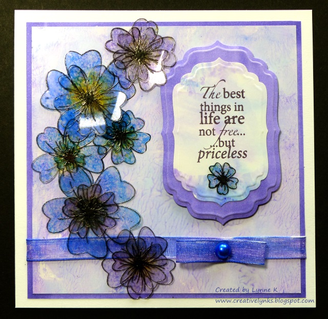
 The answer is just one! I've been having a play with my Be Creative alcohol based markers, and I wanted to see if I could create a card using only those to colour all the various elements. Of course, I had to use a water based ink to stamp the flowers and sentiment otherwise they would have been smudged by the markers, but everything is coloured with the markers.

I stamped the flowers (Honey Doo Crafts) with black Brilliance ink on to heat resistant acetate, embossed them with clear embossing powder and cut them out. I coloured them by attaching a piece of felt to a Be Creative mini ink blending tool, rubbing ink from the markers on to the felt, and then dabbing it on to the flowers.

To make the main background paper, I scribbled some colours on to my glass mat, added a few drops of hand sanitiser and smooshed it around with my finger to swirl the colours together. Then I pressed a piece of shiny card (eg. encaustic art card) over it to transfer the colour. An added bonus, (depending on the brand of sanitiser!) is that your card will smell nice!

The next job was to make the background for the sentiment. Again, I used the glass mat method, but instead of the hand sanitiser I sprayed the colours lightly with isopropyl alcohol to merge them, which gave a smoother result. Alcohol ink blending solution would work well, but I didn't have any, and anyway, isopropyl alcohol is much cheaper. You can buy it from the chemist, but they may have to order it for you, and you may be required to explain to them what you want it for!

SAFETY NOTE! If using either the hand sanitiser or alcohol spray methods, make sure your work area is well ventilated and do not use near naked flames. Also please note I cannot be held responsible for any problem resulting from your use of my methods.

For the outer border and that around the sentiment I simply coloured a piece of ordinary white card with a marker.The ribbon was coloured in the same way using two complimentary colours. Finally I used a marker to colour the self adhesive pearl (Be Creative), stamped the sentiment (Woodware) with Memento ink and diecut it with Spellbinders Label 4 dies.


I hope my experiment shows the versatility of the Be Creative Alcohol Markers, and also that you don't need lots of fancy stash to create something beautiful!

Sunday, 5 October 2014

Mists and Mellow Fruitfulness

Although my favourite season is spring, I do love the glorious autumn colours and misty mornings. And evenings, come to that. When I looked outside last night just before bedtime, it was like looking at a fantasy world. The sky was quite clear, but there was a low mist lying over the fields, with just the tops of the trees peeping above it. Lit by the moonlight, it was an eerily beautiful scene. Just wish I could have photographed it, but my camera sadly isn't up to the job. On Friday we had a day and night of torrential rain, quite a shock after such a dry September, and the river here flooded over its banks for the first time in several months. The weather has turned decidedly chilly too, time to break out the winter woollies, methinks!

Anyway, let's warm things up with our October challenge at Stamping Sensations, where we are celebrating the season with a theme of

WARM AUTUMN COLOURS

We would like to see lots of lovely greens, browns, yellows, oranges and reds.

Our sponsor this month is the fabulous Imagination Crafts, who are donating a very generous £35 voucher to the lucky winner.

I've used the Lillies Decoupage Stamp Sets by Imaginations Crafts for my card.

I began by stamping the image with black Brilliance ink and heat embossing it with clear embossing powder. The background was then coloured with Distress inks. I decided to leave the flowers uncoloured so that they would stand out. The Decoupage stamp sets are, obviously, ideal for 3D decoupaging, which would also have given more prominence to the lillies, but as the card was to be posted, I wanted to keep it quite flat.

I matted the image on to a piece of textured green card and layered it with a diecut by Britannia dies on to to the base card, which had been stamped with one of the stamps from the set, in the same Distress ink colours. The same stamp and inks were also used on the tag, along with a sentiment from the set. Some diecut leaves (Cheery Lynn) and autumn-hued threads completed the card.

For some truly gorgeous autumn inspiration, do hop over to see the wonderful projects my talented teamies have posted on the Challenge Blog. Thanks for looking!

Monday, 1 November 2010

Deja Vu!

This is a photo I took seven years ago, in Cumbria, just up the road from where my daughter used to live. It was early in the morning, the sun was just rising, and a flock of sparrows alighted in the brambles for a breakfast conference. They sat there obligingly while I took the picture and then flew away again.


Earlier this year, Paper Artsy released their Hot Picks 1005 stamp set. Click on the link and you'll see why I had to buy it! Got it on Saturday at Sir Stampalot. Here's what I made with it today.


I coloured a background with Distress inks, then stamped the birds in black Brilliance and clear embossed. The flourish at the top is also from the Paper Artsy set. The chipboard twigs and leaves are from Crafty Individuals. Again, coloured with Distress inks, as are the additional punched leaves.. To make the tag, I stamped just the outer border from a Hero Arts ticket stamp on to the back of a Making Memories ticket, then stamped the Paper Artsy "Secret Garden" inside the border. Just a bit too late for all the recent "Autumn" themed challenges!

Saturday, 18 September 2010

Leaves et Lumiere!

One of the things I did when I was decluttering was to go through the 10+ years' worth of magazines which were taking up so much space, taking out the pages I wanted to keep (putting them in ring binders) and giving away the rest. It took quite some time! Many of the magazines were Stampington publications: Somerset Studio, Take Ten, Stampers' Sampler, etc. In the September/October 2000 issue of Somerset Studio I had marked a project that I really liked the look of, intending one day to use it for inspiration. Well, I finally got round to it!

It was a beautiful framed picture by Leslie Altman. She had painted a gingko leaf with Lumiere paints and photocopied it against black paper. She had then overstamped the copy, matted it with various papers and mounted it into an ornate frame. I liked the way she had enhanced the leaf whilst still allowing its simple beauty to shine through.

No gingko trees in our garden, but I collected a few leaves and painted them with the Lumiere paints. When they were dry I tried scanning them against the black paper, but my scanner didn't pick up the colours very well, so I photographed them instead, with much better results. I printed out the pictures on to a matt photo quality inkjet paper, and then stamped over them with a text stamp (Stampin' Up) using Brilliance Galaxy Gold ink.

The first leaf, an ivy, was painted with turquoise and purple Lumiere paints (although the turquoise has come out more green in the photo) so I used some purple patterned paper to pick up the tones in the leaf, along with some black paper stamped with a Stampington flourish in gold Brilliance ink. However, when it was finished I decided I didn't like it. The background papers seemed to be competing with the leaf for attention. (Leslie's didn't! Maybe I just used the wrong papers. I'd love to put a copy of Leslie's original here, but I don't think copyright will allow it.) Anyway, I kept the next ones clean and simple.


In these three cards the leaves are clearly the focal point, with just a little subtle stamping to complement them, and I think they are much better. The leaf stamps are all by Starving Artistamps, except for the oak leaf, which is from an old foam mounted set for which I long ago lost the labels, unfortunately. The little "Autumn" stamp is by Hero Arts, and the sentiments are Personal Impressions. Here's a closer look at each of them. Click on the photos to get the big picture and see the detail better!

Oak.

Wild rose.

Herb Robert.

So, thanks for looking. What do you think? Are the simple ones better? My favourite is the wild rose. When I had got the photo on the computer I played around with it a bit, changing the colours. I'll post the pics of those when I've made the cards!

Monday, 1 February 2010

A bit different, and blog candy!

Just managing to scrape in again for this week's Tuesday Taggers, where the challenge is to use a jigsaw piece in your artwork. I puzzled over it for some time, and then decided for a change to make some earrings. Long time ago, before I started cardmaking (ie. about 20 years ago!!), I was into jewellery making, but haven't done any for ages, so this project has definitely used old stash! The two pieces I used to make the earrings are from a real old jigsaw which was destined never to be made up again as it had many pieces missing. I've no idea what the picture was, as the remaining pieces were given to me in a plastic bag, but I'd guess it was an old countryside scene. The colours were quite dark, so first of all I painted them with a white Ranger Acrylic Dabber. Next I coloured them with Brilliance inks and overstamped with my current favourite Hero Arts flourish stamp. The backs and edges were covered with a black Promarker. I gave them a top coat of clear embossing to protect them before making them up into earrings.

They are displayed on an ATC stamped with the same Hero Arts flourish. The words are by Inkadinkado and Papermania, and the tiny butterfly is also by Inkadinkado. The butterfly jigsaw piece was made with a clear peel-off sticker over an image from the latest Crafty Individuals Miniatures book: "Nature's Beauty".

I didn't have a recipient in mind when I made them, so I have decided to give them away as Blog Candy. (I hardly ever wear earrings!) If you'd like to win them, please leave me a comment, (or even better, become a follower if you are not already, though that is optional!) before next Monday, Feb 8th. Mr. Random.org will choose the winner. Please note, if the winner does not have pierced ears, I can change the fittings to suit.

Now I'm off on Brenda's blog hop (see my previous post for details).

Thursday, 7 January 2010

Poppies

One of my crafting resolutions for this year is to try more non-card projects, and to that end I am currently working on altering a little photo frame like the one I gave away with my blog candy last month. However, I couldn't resist ordering one of the new Hero Arts stamps, the Poppy Background,  which was delivered yesterday, and I just had to make a quick card with it straightaway. I love poppies, and this stamp has lots of potential. I think it is going to become one of my all-time favourite stamps.


I stamped it with Brilliance Pearlescent Chocolate and clear embossed it, then coloured it with Promarkers. The sentiment, by Craftwork Cards, was also coloured with Promarkers. Before I stuck the picture to the card, though, I was tempted to use the back rather than the front! The Promarker ink soaked through the paper and it left an interesting image on the reverse, rather like pressed flowers (see below). I might have to do another one!


Hero Arts at one time was my favourite stamp company, but their style changed somewhat a few years ago and became a bit too cute for my liking. However, their new 2010 catalogue has some absolutely gorgeous designs. I foresee a sudden depletion in my bank balance!

Monday, 16 November 2009

How many days until Christmas.....?

Another card made with the Brilliance Ink background. The flower stamp is from the Aspects of Design sheet "Summer Flowers", by The Stamp Man, (currently on sale at half price while stocks last!) and the sentiment is by Crafty Individuals. I used my Nestabilities and Cuttlebug to cut the circles and the label and punched a few flowers out of the leftover Brilliance-inked background paper.


Now I really should make some Christmas cards......

Saturday, 14 November 2009

Ideas from The Stamp Man

I managed to catch The Stamp Man's recent show on Create and Craft, and really liked Jill's ideas for making backgrounds with Brilliance inks. She put the inks on to a craft sheet, sprayed them with water and then laid her paper on top to pick up the ink. It gave a lovely, shimmery, watercolour effect. The link above is to Jill's blog, where she explains how to do it. I've had Brilliance inkpads for years and never thought of using them in this way. Of course, I had to try it out, and here are the first two cards I've made.


I wanted a marble effect for the Roman gods, so I used starlight black, galaxy gold and moonlight white Brilliance inks. I inked up two pieces of paper. The first one took up some of the ink, then I picked up what was left with the second piece which gave it a lighter coverage. I used that piece for the background and stamped and clear embossed the image on the first piece.


For the second card I used pearlescent sky blue, pearlescent purple and pearlescent orchid. All stamps are Aspects of Design by The Stamp Man, except for the sentiment, which I think is by Papermania. Border punch is by Martha Stewart.