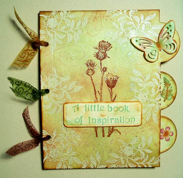
I'm loving this month's theme at Stamping Sensations! Entries are coming in nicely for our "Make It Colourful" challenge and it's great to see such bright and cheerful designs.
I made another card using stamps from our June sponsor, Visible Image.
I stamped the flowers and butterflies with Versafine Clair Ink on Cass Art hot press watercolour card and coloured them with diluted Distress Ink reinkers, using a waterbrush to blend the colours. I splattered drops of the inks over the design with a fan brush and added liquid pearls to the butterflies' bodies. I hand wrote the sentiment and stamped the colour splash (a magazine freebie designed by Visible Image) over the appropriate word.
It was a very quick card to make, and I really enjoyed the process. Sometimes I prefer to work with more muted colours for a softer effect, depending on the subject, of course, but at the moment I'm definitely going through a bright and colourful phase!
Our June challenge runs until the 1st of July, so there's still plenty of time to enter if you'd like to be in with a chance of winning a fab voucher to spend in Visible Image's online shop.
Showing posts with label Distress Inks. Show all posts
Thursday, 18 June 2020
Sunday, 5 May 2019
Back to winter!
Well, after all the water which came down in March, April turned out to be a great month! Dry, warm and sunny for the most part. Anyone would have thought it was summer already! It was obviously playing tricks on us, though, as right now it's so cold it feels as though we're back to winter, at least up here in the north. And even further north it's been snowing, apparently! Minus temperatures are forecast for us tonight. I think I put the thermal undies away too soon! How all that fits with global warming, I've no idea, so I'll just move swiftly on to this month's Stamping Sensations Challenge, where our theme for May is
We'd like your projects to show what you might find in a typical English country garden, so you could include, for instance, flowers, trees, birds, insects, wild animals, etc., or perhaps garden furniture, shed, greenhouse or even washing on a line! Whatever you choose, your main image must be stamped and relevant to the theme, otherwise your project will not be eligible. See here for our full challenge rules. You will not want to miss out on the chance to win this month's fab prize of these 2 beautiful A5 stamp sets, kindly donated by our lovely sponsors Chocolate Baroque.
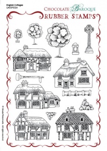

I have used Chocolate Baroque stamps on my card.
I created the background with my Gelli Plate, covering it with Distress inks and then lifting off some of the colour with stamps from the Chocolate Baroque Spring Foliage set before taking the print.
The central image is from the Home Sweet Home set and the robin is cut from the main image in the Robin the Spruce set. I coloured the butterflies (Just Butterflies set) to look like Orange Tips, which have been visiting my garden during the past few weeks. The flowers on the grass at the front are from "The Spinney" Design A Tree set.
The main image is coloured with Polychromos pencils and cut out with a Spellbinders die. I used Arteza brush pens for the robin and butterflies.
There is some truly delightful inspiration from my teamies over on the Challenge Blog, so please do go and check it out. I am so looking forward to seeing your entries for this theme.
Mine is a Scottish Country Garden but it has plenty in common with an English one! I'll leave you with a few recent photos.
* * * * * IN AN ENGLISH COUNTRY GARDEN * * * * *
We'd like your projects to show what you might find in a typical English country garden, so you could include, for instance, flowers, trees, birds, insects, wild animals, etc., or perhaps garden furniture, shed, greenhouse or even washing on a line! Whatever you choose, your main image must be stamped and relevant to the theme, otherwise your project will not be eligible. See here for our full challenge rules. You will not want to miss out on the chance to win this month's fab prize of these 2 beautiful A5 stamp sets, kindly donated by our lovely sponsors Chocolate Baroque.
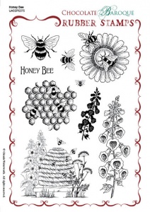

I have used Chocolate Baroque stamps on my card.
I created the background with my Gelli Plate, covering it with Distress inks and then lifting off some of the colour with stamps from the Chocolate Baroque Spring Foliage set before taking the print.
The central image is from the Home Sweet Home set and the robin is cut from the main image in the Robin the Spruce set. I coloured the butterflies (Just Butterflies set) to look like Orange Tips, which have been visiting my garden during the past few weeks. The flowers on the grass at the front are from "The Spinney" Design A Tree set.
The main image is coloured with Polychromos pencils and cut out with a Spellbinders die. I used Arteza brush pens for the robin and butterflies.
Mine is a Scottish Country Garden but it has plenty in common with an English one! I'll leave you with a few recent photos.
Orange Tip butterfly. Hard to photograph as they are hardly ever still!
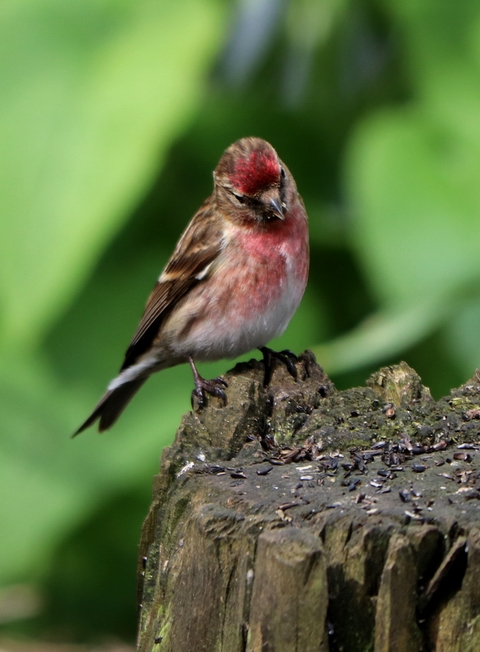
Lesser Redpoll
Auricula
Ivy Leaved Toadflax, growing in the garden walls. In our garden, the wildflowers sit happily alongside the cultivated ones. We do not have weeds!
Bank Vole. We have a family of them living in the undergrowth behind the bird feeders. The baby ones are so cute!
Yellowhammer. Due to recent population decline they are now classed as an endangered species. Not apparently so in our garden! Last year we counted 20 here on one occasion. Not so many yet this year, but still several pairs visiting regularly.
Bluebells. This seems to be a really good year for them as there are lots about, both wild and cultivated.
Sycamore. The warm April weather brought most of the trees bursting into leaf. This is my favourite time of year, when everything is fresh and new.
Heron. Not in our garden, but I took the picture from the garden as it took off from beside the river which is next to our house. We are so lucky to live here, surrounded by beautiful wildlife. It makes up for all the rain!
Sunday, 2 October 2016
Autumn Glory
Well, it doesn't seem five minutes since September arrived, and here we are at the start of October! This year is flying by! It means, of course, that it's time for our next challenge at Stamping Sensations, and this month we have one of my favourite themes -
* * * * * AUTUMN GLORY * * * * *
Not my favourite season of the year, as it reminds me that we are getting closer to winter (hate the cold and the long dark nights) but I do love the autumn leaves, trees and colours. So I will be hoping to see lots of those in our challenge entries. As usual, you may interpret the theme however you wish, but please do remember that stamping (rubber, clear or non-pre-coloured digi) must be the focal or predominant element of your project.
Our October sponsor is the wonderful Penny Black, and we have a fab selection of their products for our winner.
Recently I came across Andy Skinner's video showing how to do the alcohol ink float technique. Haven't used my alcohol inks for ages, so I decided to try the technique for my Autumn card. It was very easy to do!
The effect, produced on porous paper or card, is much softer than that obtained by using the inks on non-porous surfaces, and it makes lovely backgrounds. Having made mine, I stamped over it with Inkylicious leaf stamps, which I then coloured with diluted distress inks. Being water based, the DIs didn't affect the alcohol ink background. The next step was to stamp some of the flowers and the butterfly from Penny Black's "Enamor" set, which I also coloured with distress inks. The sentiment is from the same set.
I added some shading around the leaves, flowers and butterfly with a Spectrum Noir pencil to make them stand out a bit more. The finished picture was then mounted with various layers on to a 7" x 7" card. The patterned paper is by Bo Bunny. A snippet of ribbon, a few punched leaves and a flower button were the finishing touches. I didn't look in my button box for a suitable button until after I had coloured the flowers, and it is a lucky coincidence that I just happened to have one in the same style and colour, which I'd forgotten I had!
I thoroughly enjoyed trying out the technique, and it's one I think I'll be using again. If you'd like to try it too, you can watch Andy's video tutorial here.
My lovely teamies have some gorgeous projects to inspire you on the Challenge Blog, so do pop over and take a look, and we will look forward to seeing lots of awesome autumn entries!
Sunday, 5 October 2014
Mists and Mellow Fruitfulness
Although my favourite season is spring, I do love the glorious autumn colours and misty mornings. And evenings, come to that. When I looked outside last night just before bedtime, it was like looking at a fantasy world. The sky was quite clear, but there was a low mist lying over the fields, with just the tops of the trees peeping above it. Lit by the moonlight, it was an eerily beautiful scene. Just wish I could have photographed it, but my camera sadly isn't up to the job. On Friday we had a day and night of torrential rain, quite a shock after such a dry September, and the river here flooded over its banks for the first time in several months. The weather has turned decidedly chilly too, time to break out the winter woollies, methinks!
Anyway, let's warm things up with our October challenge at Stamping Sensations, where we are celebrating the season with a theme of
We would like to see lots of lovely greens, browns, yellows, oranges and reds.
Our sponsor this month is the fabulous Imagination Crafts, who are donating a very generous £35 voucher to the lucky winner.
Anyway, let's warm things up with our October challenge at Stamping Sensations, where we are celebrating the season with a theme of
WARM AUTUMN COLOURS
We would like to see lots of lovely greens, browns, yellows, oranges and reds.
Our sponsor this month is the fabulous Imagination Crafts, who are donating a very generous £35 voucher to the lucky winner.
I've used the Lillies Decoupage Stamp Sets by Imaginations Crafts for my card.
I began by stamping the image with black Brilliance ink and heat embossing it with clear embossing powder. The background was then coloured with Distress inks. I decided to leave the flowers uncoloured so that they would stand out. The Decoupage stamp sets are, obviously, ideal for 3D decoupaging, which would also have given more prominence to the lillies, but as the card was to be posted, I wanted to keep it quite flat.
I matted the image on to a piece of textured green card and layered it with a diecut by Britannia dies on to to the base card, which had been stamped with one of the stamps from the set, in the same Distress ink colours. The same stamp and inks were also used on the tag, along with a sentiment from the set. Some diecut leaves (Cheery Lynn) and autumn-hued threads completed the card.
For some truly gorgeous autumn inspiration, do hop over to see the wonderful projects my talented teamies have posted on the Challenge Blog. Thanks for looking!
Sunday, 6 July 2014
Summer at last!
Just hoping the last two weeks aren't all we're going to get! For once, Scotland seems to have had better weather than the rest of the country but as we start our school holidays this week, I fear things will probably revert to form before long!
Anyway, it's a new month, and at Stamping Sensations we are brightening things up whatever the weather with a theme of
***** SUMMER BLOOMS *****
Garden glories or wildflowers or weeds, we don't care which, just show us flowers galore! But please do remember, as we are a stamping challenge there must be some hand rubber stamping on your project. Entries containing only digital images will not be considered for the prize or top 3.
Making a return visit as our sponsor for July is the wonderful Heartfelt Creations, who are generously offering a voucher to the value of $60 to spend in their online store.
They have asked us to point out that should the prize winner live outside the USA, a charge for postage, packing and shipping will apply.
For my card I've taken inspiration from the masses of beautiful wildflowers adorning our hedgerows just now.
The background was colour washed with diluted Distress Inks on water colour paper, then various flowers and a couple of butterflies were stamped over. Some of the flowers were coloured with Inktense watercolour pencils. Stamps used were from Lavinia Stamps, Chocolate Baroque and Crafty Individuals. The sentiment is by Inkylicious.
Flowers are, of course, one of my favourite topics for cards, so I am really looking forward to seeing lots of lovely entries full of summer blooms! My fabulous teamies have definitely excelled themselves this month with their gorgeous creations, so don't forget to check them out on the Challenge Blog if you are in need of inspiration. Thanks for looking!
Sunday, 5 May 2013
Floating.....
Yes, I know, two posts in one day from me must come as a bit of a shock! However, I came across a rather gorgeous background technique on Pinterest and couldn't wait to try it out. It's called reinker float. Basically you emboss a design on to your card, soak it with water and then "float" the reinkers on the water so that they spread and merge. I won't go into all the details now as you can see just how to do it in a tutorial by Selene Kempton here.
I had avoided joining Pinterest until very recently, knowing that if I did I would end up spending quite a lot of time there! However, I've succumbed, and I'm so glad I did! There is so much inspiration out there and my boards are filling up very quickly. That's why I wanted to give this a go straight away rather than spend so much time browsing that I never got round to making anything. Must keep that thought in mind.......
I don't have any "shimmer white cardstock" (which Selene recommends and which I presume is from Stampin' Up), so I used some pearlescent card which seemed to work fine. (Bought it a long time ago so can't remember exactly what type it is, but I think it was from PDA and the colour is "ice white".) The main criterion is that the card should hold the water on top rather than absorbing it.
Most times when I try a new technique it takes several goes before I master it to my satisfaction, but I'm actually quite pleased with my first attempt at this one! Of course it helped that it was easy to do! Using the pearlescent card gives it a lovely shimmer, almost mother-of-pearl like. The photo doesn't do it justice.
The flower stamp is by Technique Tuesday. I stamped it with Versamark ink and embossed with clear powder (you could also use white powder but I wanted the sheen of the card to show through). Having thoroughly soaked it, I then dropped on Distress reinkers (Dusty Concord, Shaded Lilac and Antique Linen). The card didn't need much besides the flower panel to finish it off. (Sentiment by Technique Tuesday, butterfly by Justrite, paper flower by Prima.)
I had avoided joining Pinterest until very recently, knowing that if I did I would end up spending quite a lot of time there! However, I've succumbed, and I'm so glad I did! There is so much inspiration out there and my boards are filling up very quickly. That's why I wanted to give this a go straight away rather than spend so much time browsing that I never got round to making anything. Must keep that thought in mind.......
Sunday, 4 November 2012
Stamping Sensations - Traditional Christmas
It's an exciting day for us all at Stamping Sensations as we launch our first challenge under our new name! I expect everyone is now well into Christmas card making, so our theme for November should certainly appeal! We'd love to see your projects celebrating a
TRADITIONAL CHRISTMAS
Our fab sponsor this month is IndigoBlu, who have given us a stunning prize! A Flitter Glu starter set, containing everything you need for wonderful gilding effects, a gorgeous tree stamp, and a special edition Movember set which is really fun! We also have a little extra prize from Stamping Sensations.Have a look on the Challenge Blog for full details, and also to see some great inspiration from my fantastic teamies and this month's lovely guest designer.
I've used the IndigoBlu Bare Forest stamp as the focus for my card, stamped over a background made with Inkylicious ink dusters and Distress Inks. The holly accent is an old wood mounted stamp from Hero Arts, no longer available, although they now have the same design in a slightly larger cling stamp. The sentiment, stamped on a Nestabilities label, is one of the first stamps I ever bought, about 20 years ago! It was made by a company called Embossing Arts.
Not only are IndigoBlu giving us that fabulous prize, they are also offering everyone a 10% discount off their products until 15th December! How cool is that?! Simply go over to our Challenge Blog to get your Discount Code.
Can't wait to see all your Christmas creations this month. Good luck everyone!
.
Saturday, 16 June 2012
Dandelions
I've been having another play with the Pan Pastels, and I think they're growing on me. I still think they're messy (I seem always to end up with chalky dust over everywhere, but maybe that's just me!) but the end result probably justifies the means.
I made two cards to compare. I did one background with the new Spring Distress Inks applied with ink dusters, and the other with the Pan Pastels. The pastels do give a lovely soft effect, while the DIs are more vibrant, but I like them both! The PPs I bought at the show are mostly pale shades. I think I might have to get some more intense ones....
Anyway, here are the cards (DI background first, all stamps by Inkylicious). See what you think.
Monday, 1 November 2010
Deja Vu!
This is a photo I took seven years ago, in Cumbria, just up the road from where my daughter used to live. It was early in the morning, the sun was just rising, and a flock of sparrows alighted in the brambles for a breakfast conference. They sat there obligingly while I took the picture and then flew away again.
Earlier this year, Paper Artsy released their Hot Picks 1005 stamp set. Click on the link and you'll see why I had to buy it! Got it on Saturday at Sir Stampalot. Here's what I made with it today.
I coloured a background with Distress inks, then stamped the birds in black Brilliance and clear embossed. The flourish at the top is also from the Paper Artsy set. The chipboard twigs and leaves are from Crafty Individuals. Again, coloured with Distress inks, as are the additional punched leaves.. To make the tag, I stamped just the outer border from a Hero Arts ticket stamp on to the back of a Making Memories ticket, then stamped the Paper Artsy "Secret Garden" inside the border. Just a bit too late for all the recent "Autumn" themed challenges!
Saturday, 30 October 2010
Another fab Blog Girl Day!
Today saw our second "Blog Girl Day" at Sir Stampalot. We had a great time, great company , had a good natter, a yummy lunch, and even made some cards! Just wanted to say a huge thank you to Brenda and Chris for organising the day and designing some gorgeous projects for us to make. Also to Janice and Andy for hosting us, and keeping the shop open for the necessary retail therapy afterwards!
Here's what we made (my versions of Brenda's and Chris's designs). The first two cards were designed by Chris. I admired her pink and bling bauble card when I first saw it on her blog, so I was delighted that she showed us how to make it today. And I love the little step card with the tipsy Christmas trees!
Brenda's creations were equally gorgeous, and both shiny, so unfortunately they haven't photographed very well. The first one uses layers of stamping over a Distress Ink and Glimmer Mist background. The second was made on acetate, with leaves stamped on top using black Staz-on ink, and the reverse coloured with alcohol inks. It was then backed with text torn from a book and crumpled tin foil. The effect of the foil is amazing, and the photo really does not do it justice.
The book chosen for the text caused some hilarity, being a rather seedy crime novel! We had to be very selective about which pages we used! But the end result was very effective. I was proud of the fact that I managed to complete all four cards, unlike the previous time when I didn't actually get any finished on the day.
Anyway, thanks again, everyone, for a really lovely day. Looking forward to the next one!
Here's what we made (my versions of Brenda's and Chris's designs). The first two cards were designed by Chris. I admired her pink and bling bauble card when I first saw it on her blog, so I was delighted that she showed us how to make it today. And I love the little step card with the tipsy Christmas trees!
Brenda's creations were equally gorgeous, and both shiny, so unfortunately they haven't photographed very well. The first one uses layers of stamping over a Distress Ink and Glimmer Mist background. The second was made on acetate, with leaves stamped on top using black Staz-on ink, and the reverse coloured with alcohol inks. It was then backed with text torn from a book and crumpled tin foil. The effect of the foil is amazing, and the photo really does not do it justice.
The book chosen for the text caused some hilarity, being a rather seedy crime novel! We had to be very selective about which pages we used! But the end result was very effective. I was proud of the fact that I managed to complete all four cards, unlike the previous time when I didn't actually get any finished on the day.
Anyway, thanks again, everyone, for a really lovely day. Looking forward to the next one!
Labels:
acetate,
alcohol inks,
Distress Inks,
Glimmer Mist,
Sir Stampalot,
stamping,
Staz-on,
tin foil
Thursday, 8 July 2010
Sir Stampalot July Challenge
The theme for the Sir Stampalot July Challenge is Lazy Hazy Days of Summer. There's not much that says summer to me more than poppies, so when I found a pack of gorgeous poppy design napkins in S****burys I thought they'd be just right to make a card with.
Next I glued the top layer to a piece of thin card to strengthen it and cut out some of the flowers and leaves. These made a border down the side of the card along with a strip of paper coloured with the Barn Door DI and cut with a Martha Stewart punch.
The stamped image is the beautiful new "Poppy Field" by Crafty Individuals (currently free with orders over £30!) which I coloured with Distress Inks (Barn Door, Bundled Sage and Shabby Shutters).
As you can see, they are rather bold and bright, so a large size base card was called for, in this case an 8" x 8" one from Craftwork Cards. I wasn't quite sure what to do at first, as the large, bright flowers would overwhelm any image I tried to put with them. However, when I separated the layers of the napkin, I found that the middle layer had picked up some colour from the printed top layer, and was in effect printed with a ghost image of the poppies. Perfect! It became the background for my card, with a narrow border sponged around the edge with Barn Door Distress Ink.
A computer generated text on a Nestabilities label and a few punched butterflies were the final embellishments.
And here's the finished card.
PS. My lovely butterfly blog background from Scrappin' Blogs disappeared this afternoon! On investigating, I found that Scrappin' Blogs are having problems with Photobucket (basically it seems they are too popular!) and need to find a new server. I'm not sure what the situation is with their backgrounds at the moment, so I've found another for my blog for the time being from The Cutest Blog on the Block. Maybe it's time I had a change anyway.
Friday, 25 June 2010
Normal service is resumed!
Back to my more usual style for this card. I love the look of the Tim Holtz Tattered Florals dies, but they are too big for the sort of things I'd want them for, so I decided to make my own distressed flowers using the EK Success retro flower punches. I wanted them to look as though they were made from old book pages. I've been wanting to do this for quite some time. However, I couldn't bring myself to tear the pages out of a book! A friend of mine even gave me an old book which she'd got specially for me to use, but it was a book of wild flowers with some lovely old pictures in, and I just couldn't do it! I thought I would scan them instead. Then I found a website where you can download copyright free books, so I printed some pages from that and made them look old with Distress Inks (Tumbled Glass and Antique Linen, which I also used on the butterfly and sentiment). Having punched out the flowers I just tore the edges of the petals a bit & then inked around them. Not quite the same as Tim's, but near enough to the look I wanted.
The background paper is a digital download from Two Peas in a Bucket, one of the "Art Papers III" digital kit by Vinnie Pearce. The text-printed leaves on it went perfectly with my flowers. It's such a pretty paper that I kept the embellishments to a minimum so as not to hide it. The photo doesn't do it justice. The punched butterfly is overstamped with Hero Arts "Delicate Vine", and the sentiment is by Darkroom Door. The lace and ribbon came from my late mother's stash. She was a crafter, though her speciality was in fabrics and dried flower arranging. She was also a hoarder and loved a bargain, with the result that she had more materials stashed away than she was ever likely to use. I think I've inherited the tendency! But if that's the price of also inheriting her love of arts and crafts and making things, it's one I'm happy to pay!
Sunday, 6 June 2010
Brilliant Day!
Well, the day finally arrived, and Sally, Megan and I set off to Sir Stampalot for our eagerly anticipated Blog Girl Get-together. It was lovely to be able to put faces to names (and blogs!) and spend the whole day playing, although with all the talking and laughing going on, not to mention eating (at lunchtime a delicious buffet appeared as if by magic!) some of us didn't get quite as much crafting done as we might have!
Brenda and Chris had prepared some wonderful projects for us to make, and since we wanted to try as much as possible, many of them were started and then put carefully aside to finish off at home. Chris's first demo was a really neat little album for recipes, photos, etc, with mini envelopes for pockets, then Brenda showed us how to make a lovely book/album using a new Sizzix Bigz Pro die using distressing and resist techniques. Other projects used brayering, masking and decoupage. I have yet to complete my little photo album, but have just finished the book.
(I used Distress Inks, and stamps by Hero Arts, Penny Black, Magenta, Inkadinakdo, and Crafty Individuals. The flourishes were cut with a die by Marianne Design.)
It was a very warm day, but the atmosphere of fun and camaraderie was even warmer. So to Brenda, Chris, Jules, Linda, Hayley, Rosie, Amanda, Sally and Megan, thanks for your company, and I hope you all enjoyed the day as much as I did. Thanks also to Janice and Andy for keeping the shop open for us to indulge in some retail therapy afterwards (not to mention during as well!) to everyone who contributed to lunch (Jules's heart shaped cheese scones were just to die for!) and huge thanks to Brenda and Chris for teaching us some gorgeous projects and for all their hard work which made the day such a success. Here's to the next time!
Labels:
Crafty Individuals,
Distress Inks,
Hero Arts,
Inkadinkado,
Magenta,
Penny Black,
Sir Stampalot,
Sizzix
Thursday, 25 February 2010
Amazing Blog Candy from The Stamp Man!
Jill is giving away either a complete set of the new Tim Holtz Distress ink pads (12 new gorgeous colours!) or the complete set of the 12 new re-inkers to two very lucky winners!
If you'd like to be in with a chance of winning , hop over to Jill's blog for all the details. This really is a fantastic prize!
Saturday, 7 November 2009
Meadow
Taking the colour removal technique a step further, I made this.

Using encaustic art card, the background was sponged with Distress inks, then the honesty seed pods were stamped in black and clear-embossed. I was thus able to remove the colour from them using a damp paintbrush without the water overflowing on to the rest of the background. I did the same for the campion flower near the centre, but having removed the background colour I then painted the flower with Distress inks. The remaining elements were simply stamped with Versamagic inks.
The picture was mounted on to an 8" x 8" card from Craftwork Cards, from where also came the background paper and the butterfly greeting. The butterfly was coloured with a Promarker. All stamps are Elusive Images from Graphicus, except for the trees in the background. The tiny fir trees are by Stampscapes, and the other tree is from Lavinia Stamps.

Using encaustic art card, the background was sponged with Distress inks, then the honesty seed pods were stamped in black and clear-embossed. I was thus able to remove the colour from them using a damp paintbrush without the water overflowing on to the rest of the background. I did the same for the campion flower near the centre, but having removed the background colour I then painted the flower with Distress inks. The remaining elements were simply stamped with Versamagic inks.
The picture was mounted on to an 8" x 8" card from Craftwork Cards, from where also came the background paper and the butterfly greeting. The butterfly was coloured with a Promarker. All stamps are Elusive Images from Graphicus, except for the trees in the background. The tiny fir trees are by Stampscapes, and the other tree is from Lavinia Stamps.
Tuesday, 3 November 2009
Bowing to the inevitable
Well, I've been a bit out of touch lately, having been away for the best part of two weeks, so I decided that now I'm back I'd better show willing & get on with some Christmas cards. I really don't know why the prospect doesn't fill me with enthusiasm. Maybe it's because I'd rather not start thinking of Christmas before December and then don't have enough time to spend on them and end up with rushed designs that I'm not happy with.
However, whatever the reason, I've managed to make a start. I've continued with the colour removal technique using Distress Inks as in my recent posts, with brass stencils this time to produce the backgrounds.
The teddy & cat stamp was free with a magazine, so I thought I might as well try it. It's a bit too cute for my liking, but that's okay because I won't be sending it to myself. I cut it out with one of my new Nestabilities Labels 8 set and coloured it with Promarkers. I wanted a border around it, but the next size up Nestie was too big, so I went around the edge with a Promarker instead. The greeting is from Craftwork Cards. The snowflake stencil was also a magazine freebie.
The poinsettia on the second card is made from a couple of Craftwork Cards flowers, originally white but coloured with Promarkers. Likewise the greeting. I couldn't avoid the gold lettering with the Promarker, but I found that I could remove the ink from it afterwards with the Promarker blender pen.The all-over holly stencil is one I've had for several years, and I'm afraid I can't remember where it was from. The scalloped border around the Cuttlebug-embossed circle, and the outer red border, were coloured with Promarkers to match the flower. Can you guess I'm really into Promarkers at the moment?! I love being able to co-ordinate everything with them. I nearly got carried away and coloured some ribbon to match as well, but then I found some paper lace hiding at the back of a drawer and decided to use that instead. Of course, I could have coloured that too, but I thought I'd leave it as it was to go with the white circle.

Well, that's two done. I feel better now!
However, whatever the reason, I've managed to make a start. I've continued with the colour removal technique using Distress Inks as in my recent posts, with brass stencils this time to produce the backgrounds.
The teddy & cat stamp was free with a magazine, so I thought I might as well try it. It's a bit too cute for my liking, but that's okay because I won't be sending it to myself. I cut it out with one of my new Nestabilities Labels 8 set and coloured it with Promarkers. I wanted a border around it, but the next size up Nestie was too big, so I went around the edge with a Promarker instead. The greeting is from Craftwork Cards. The snowflake stencil was also a magazine freebie.The poinsettia on the second card is made from a couple of Craftwork Cards flowers, originally white but coloured with Promarkers. Likewise the greeting. I couldn't avoid the gold lettering with the Promarker, but I found that I could remove the ink from it afterwards with the Promarker blender pen.The all-over holly stencil is one I've had for several years, and I'm afraid I can't remember where it was from. The scalloped border around the Cuttlebug-embossed circle, and the outer red border, were coloured with Promarkers to match the flower. Can you guess I'm really into Promarkers at the moment?! I love being able to co-ordinate everything with them. I nearly got carried away and coloured some ribbon to match as well, but then I found some paper lace hiding at the back of a drawer and decided to use that instead. Of course, I could have coloured that too, but I thought I'd leave it as it was to go with the white circle.

Well, that's two done. I feel better now!
Labels:
Christmas,
Craftwork Cards,
Cuttlebug,
Distress Inks,
Nestabilities,
Promarkers,
stencils
Monday, 12 October 2009
Experimenting
I'm still intrigued by the notion that it's possible to create interesting backgrounds by taking colour off rather than putting it on. This time, using the same materials as in my previous post, (Distress Inks and encaustic art card) I wanted to see whether I could make a pattern with the Victoria Cuttlebug embossing folder. I inked up the card as before, and then lightly sprayed the open Victoria folder with plain water on the side with the raised (as opposed to indented) pattern. Then I laid the inked side of the card over the wet side of the folder, closed up the folder, gently smoothed it over and straightaway removed the card before it got too wet. NB. I didn't put it through the Cuttlebug! I blotted it with a piece of kitchen roll and was pleased to see that the pattern had transferred to the card pretty well.
From the patterned card I cut and embossed a Nesties Labels 2. I wanted to put a border around it, but the next size up would have made one too wide. So I coloured around the edge, following the embossed line, with a Promarker instead. Because the lighter areas of the pattern showed through, it gave the effect of a shadow. To complete the card I added a panel of white card embossed with the Victoria folder in the usual way, a few Prima flowers and punched leaves and some sheer ribbon. The sentiment is by Penny Black.
Sunday, 11 October 2009
Autumn colours
My favourite season of the year is spring, when everything is bright and fresh and new. I don't like the dark mornings and evenings of the late autumn and winter, or the dull days. Having said all that, though, I do enjoy the colours of autumn. I am lucky to live in an area with lots of trees, and they are now changing their hues. I can sit at my desk and look at them through the window. Across the road from our house are some beautiful old elms, and the wind this afternoon brought the leaves swirling down like snow. We have a small forsythia bush in the front garden, and just now it is looking quite spectacular.

I wanted to capture the autumn colours in a card, and at the same time try out a technique I saw in the wonderful StampARTic Blog. It used foam stamps to take away colour from a Distress Inked background. The foam stamps were simply sprayed with water and stamped on to the background. Unfortunately I don't have any foam stamps. I do, however, have stencils and sponges. I figured that I might get a similar effect by stencilling with a damp sponge, and it worked! First I tried it on plain card, and it was not bad, but the best result was using encaustic art card, which is semi-gloss. The Distress Inks stay wetter on it for longer and can be blended more easily. Having made the background I then taped a stencil to it and sponged it with clean water.
My first attempt was not very good, as I had the sponge too wet and the water seeped under the stencil. Having the sponge just slightly damp was much better. I also found that I didn't need as much water as I thought anyway, because the colour faded even more as it dried. Another advantage of the encaustic art card is that the water doesn't bleed into it as much as with plain card, so the image stays sharper.
I used a stencil by The Crafter's Workshop, called "Windsong," which I thought was really quite appropriate. It reminds me of leaves being blown about in the wind, just perfect for this card. The tree and leaf stamps are Elusive Images from Graphicus, and the word is by Hero Arts. I really like this stencil technique, and I'll be doing more of it.

I wanted to capture the autumn colours in a card, and at the same time try out a technique I saw in the wonderful StampARTic Blog. It used foam stamps to take away colour from a Distress Inked background. The foam stamps were simply sprayed with water and stamped on to the background. Unfortunately I don't have any foam stamps. I do, however, have stencils and sponges. I figured that I might get a similar effect by stencilling with a damp sponge, and it worked! First I tried it on plain card, and it was not bad, but the best result was using encaustic art card, which is semi-gloss. The Distress Inks stay wetter on it for longer and can be blended more easily. Having made the background I then taped a stencil to it and sponged it with clean water.
My first attempt was not very good, as I had the sponge too wet and the water seeped under the stencil. Having the sponge just slightly damp was much better. I also found that I didn't need as much water as I thought anyway, because the colour faded even more as it dried. Another advantage of the encaustic art card is that the water doesn't bleed into it as much as with plain card, so the image stays sharper.I used a stencil by The Crafter's Workshop, called "Windsong," which I thought was really quite appropriate. It reminds me of leaves being blown about in the wind, just perfect for this card. The tree and leaf stamps are Elusive Images from Graphicus, and the word is by Hero Arts. I really like this stencil technique, and I'll be doing more of it.
Labels:
Autumn,
Distress Inks,
Elusive Images,
Hero Arts,
Trees
Subscribe to:
Posts (Atom)